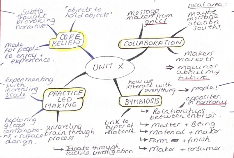
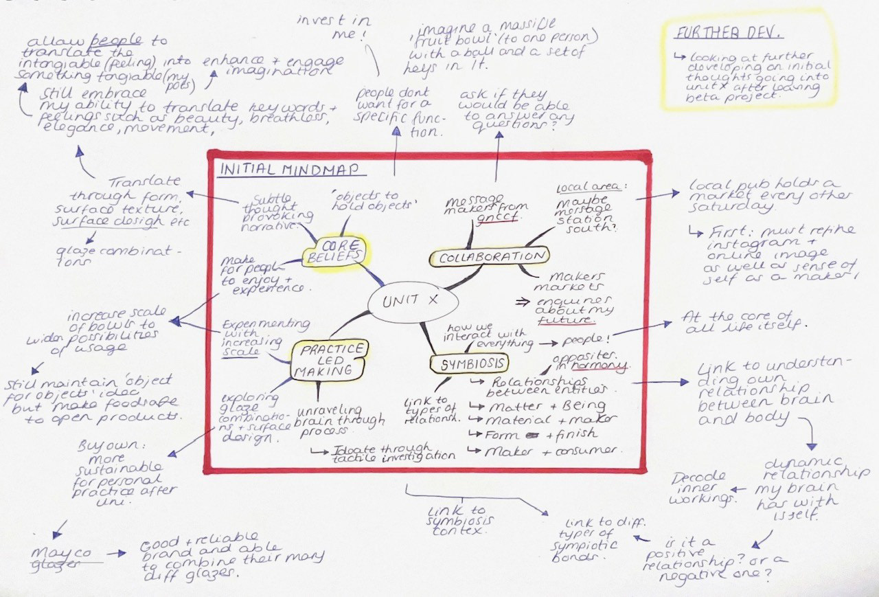
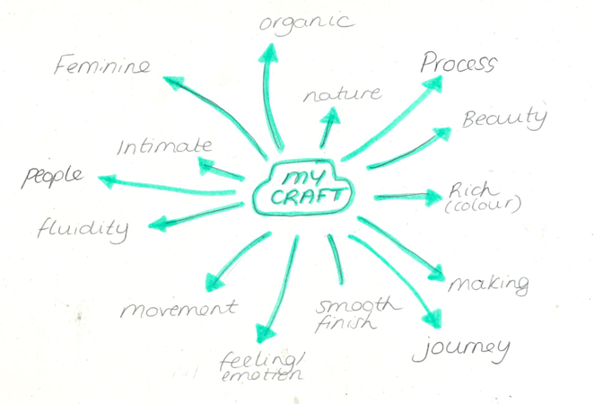
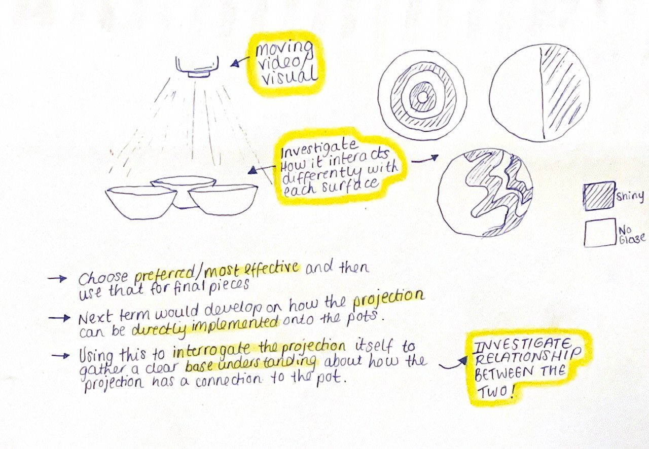
Mind map in response to tutorial feedback:
To start off the creative process, I wanted to brainstorm some ideas that I want to take forward from the Beta Project so that I would be able to map out and make sense of my thoughts. See below for mind map and then below again for further expansion on those thoughts:
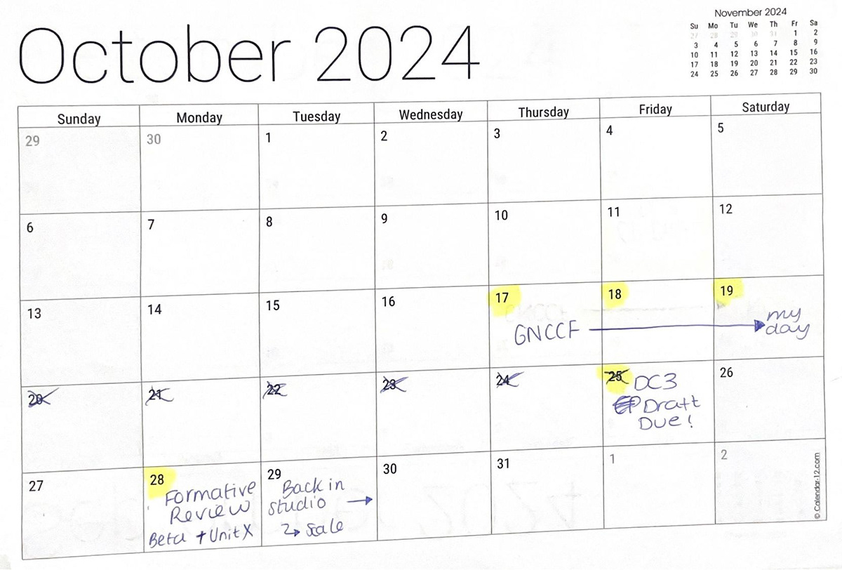
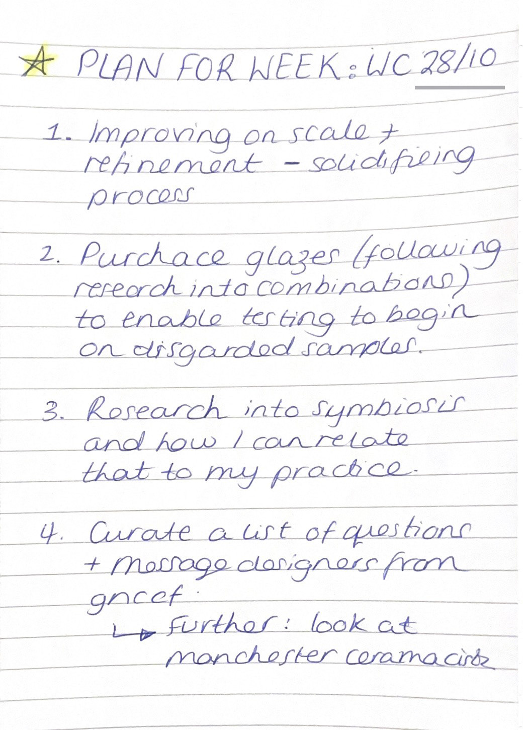
Plan for Week:
Symbiosis Research:
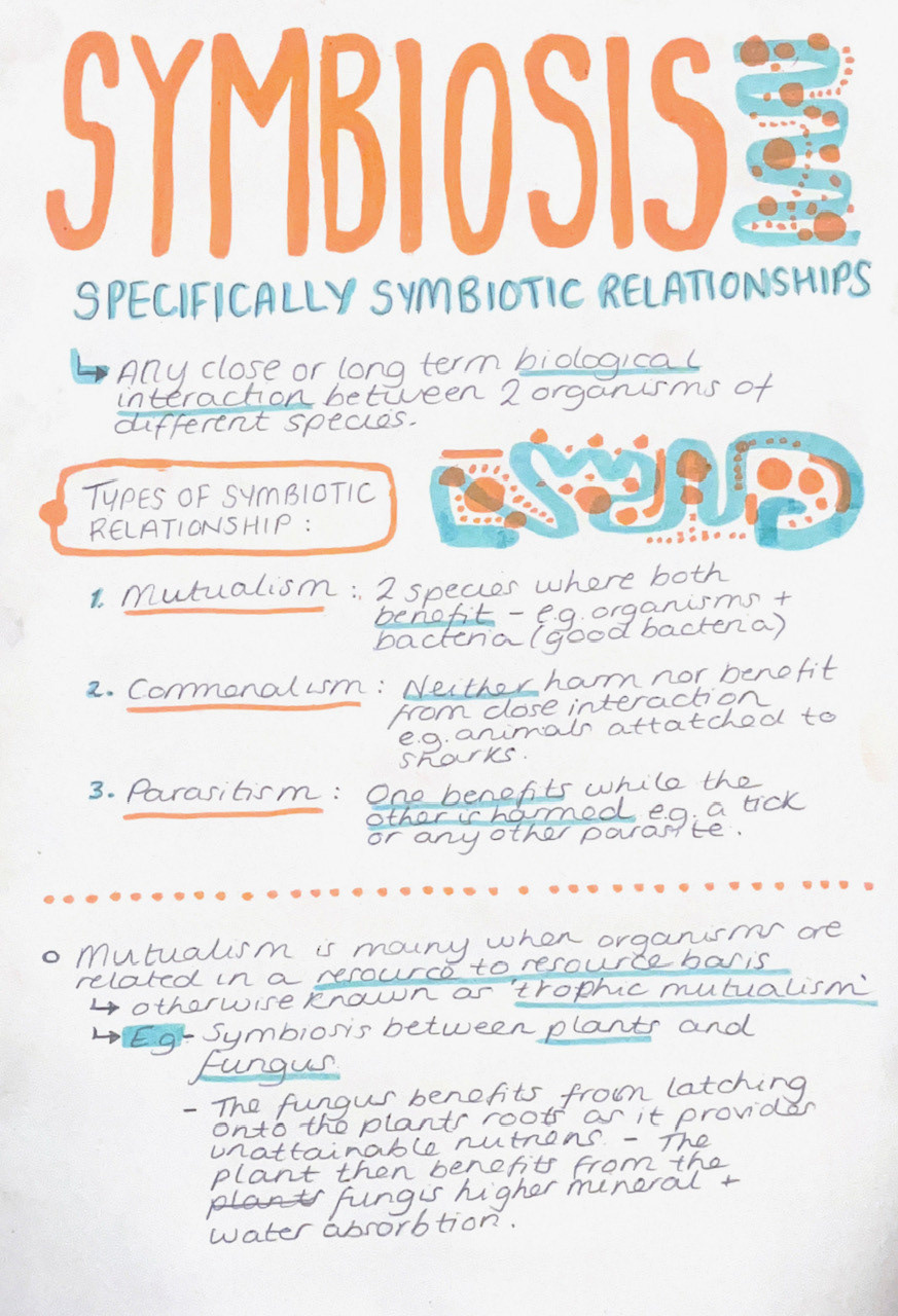
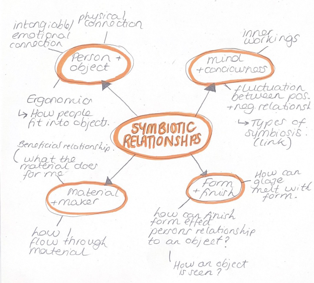
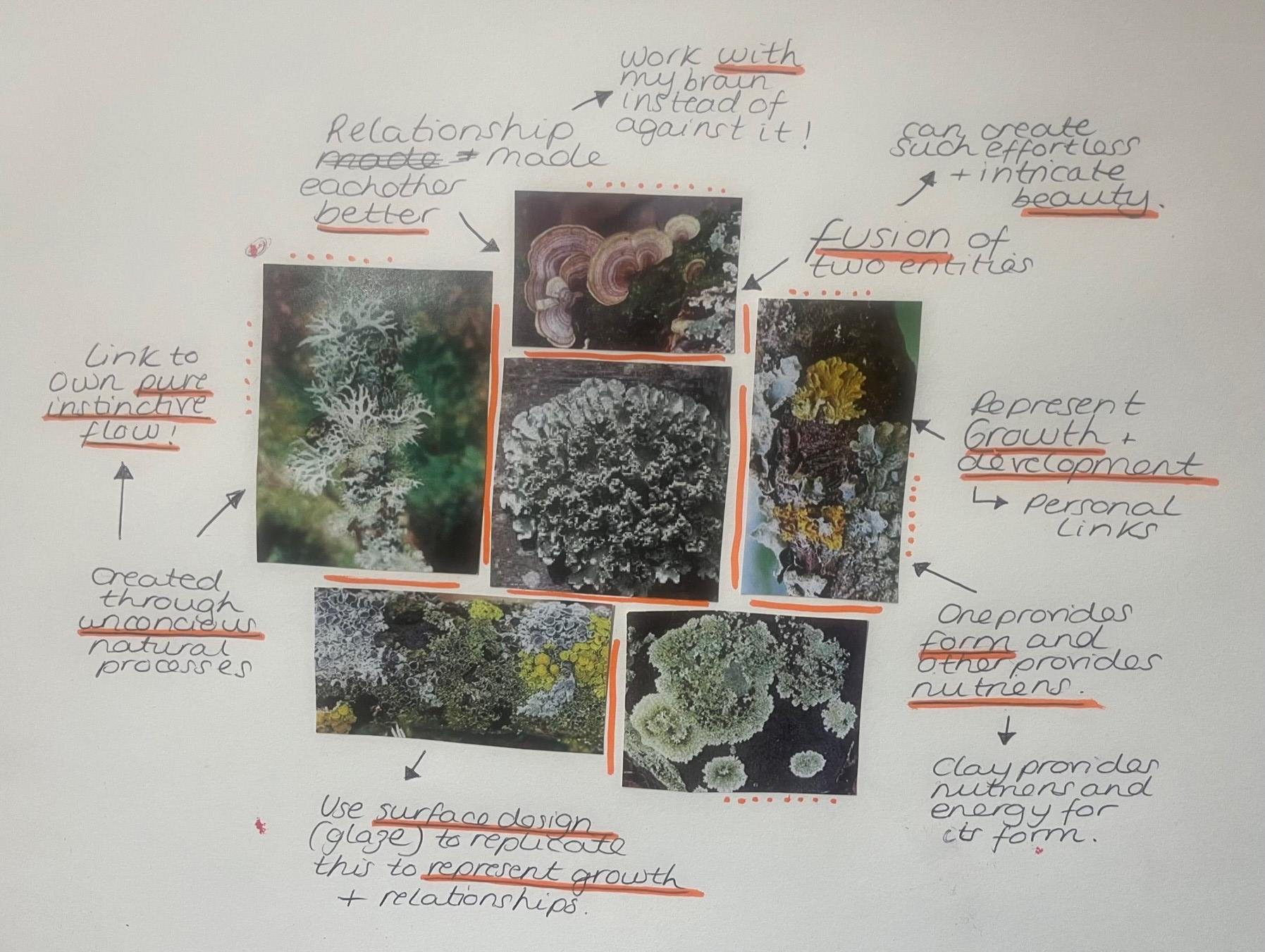
After doing a bit of base research into symbiosis as a whole, I decided to create a mind map breaking down my connection to symbiosis and more specifically relationships. Throughout my whole ceramics journey, I have always had a deep connection to my personal process and my relationship with clay. However, looking into symbiosis has completely opened my eyes because it has made me realise that there are a plethora of different connections and relationships that drive my work at its core that are all integral parts of my intrinsic schemas. Through Beta Project, I was able to realise that one of the main relationships that I like to analyse is the relationship between me and my own mind and looking at my own inner workings. How my mind works has always been quite a mystery to me and through looking at symbiotics, it made me ask myself the questions of: what kind of relationship do I have with my own brain? does the relationship fluctuate and if so can it interchange change from a positive to a negative relationship? This also links into investigating the material and maker relationship as these questions are something that I would like to consider going into this project; looking at how clay can be a vessel for those thoughts as well as how I can translate this intangible relationship into my physical making.
Another relationship that I have always been interested in is the one between is person and object. My interest between object relationships stems from my own connection to personal objects and how they have the ability to make me feel. For example, I personally love old objects as I believe they have a story to tell and ignite my imagination by making me ask myself questions like, who owned this before me? did they love it? what did they use it for? etc. I also love the fact that it feels like it is personal to me in the sense that its a one off piece; almost like my own personal treasure. The way that people interact with objects has always fascinated me because I think that it can tell you so much about a person and for some people, the connection to objects can go much deeper than simply what they can touch. Also, I could possibly look further into tangible physical connection in relation to ergonomics and how people interact with objects around them; possibly link that into my work by adding things like changes in form where your hands go? The idea that an object can be part of a person and can exist in harmony. I am also interested in how form and finish can successfully work in harmony to form an aesthetic link for the consumer/individual and aid them in perceiving the concept of symbiosis and relationships within my work.
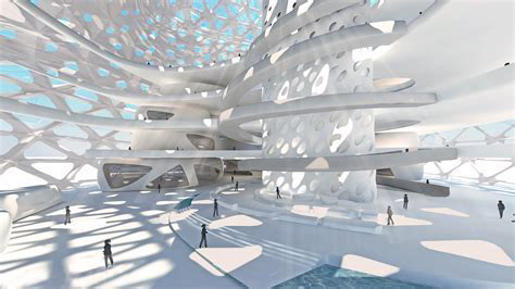
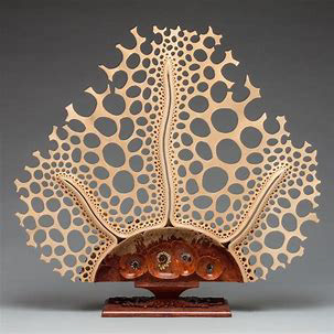
Inspiration Research: Symbiosis in Architecture
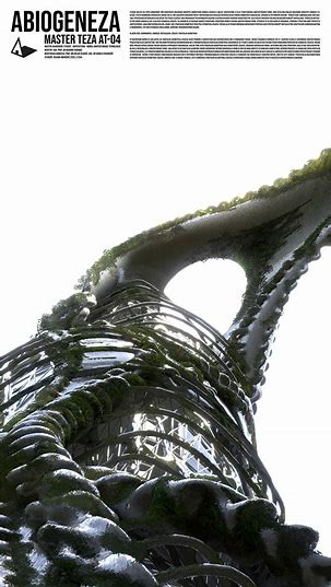
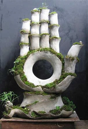
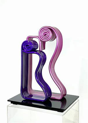
Inspiration Research: Symbiosis in Sculpture
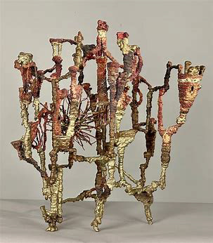
"Symbiosis" Ibram Lassaw, Abstract Metal Bronze Sculpture
Extraordinary symbiosis between art and botany, by various artists from Opiary Studio
'Symbiosis' - Free standing wood sculpture inspired by symbiosis by Mark Doolittle
'Symbiosis' by Lina Husseini
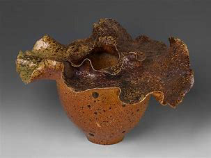
Patricia Mato-Mora: 'The Fine Line Between'
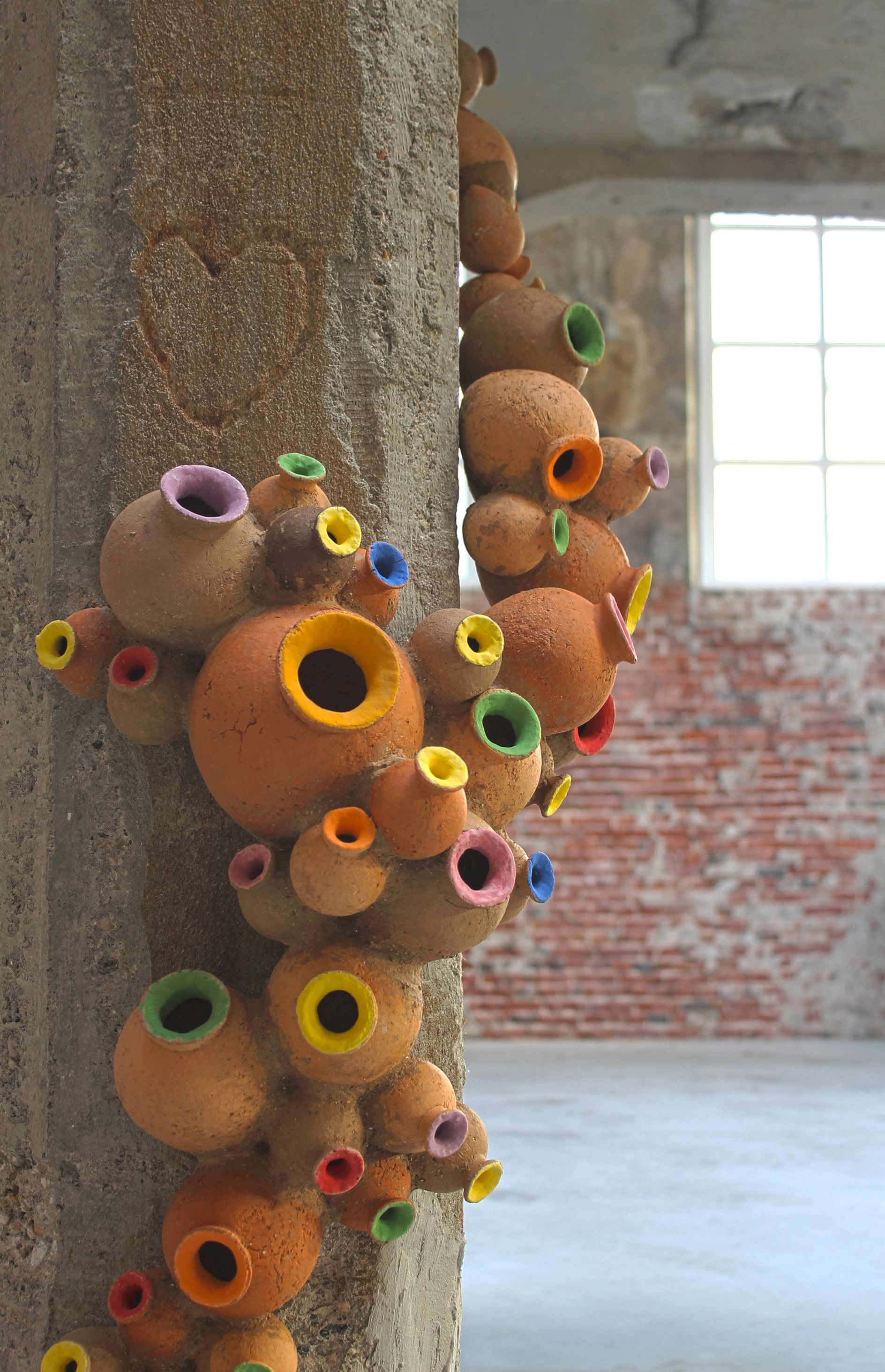
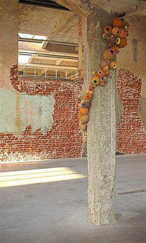
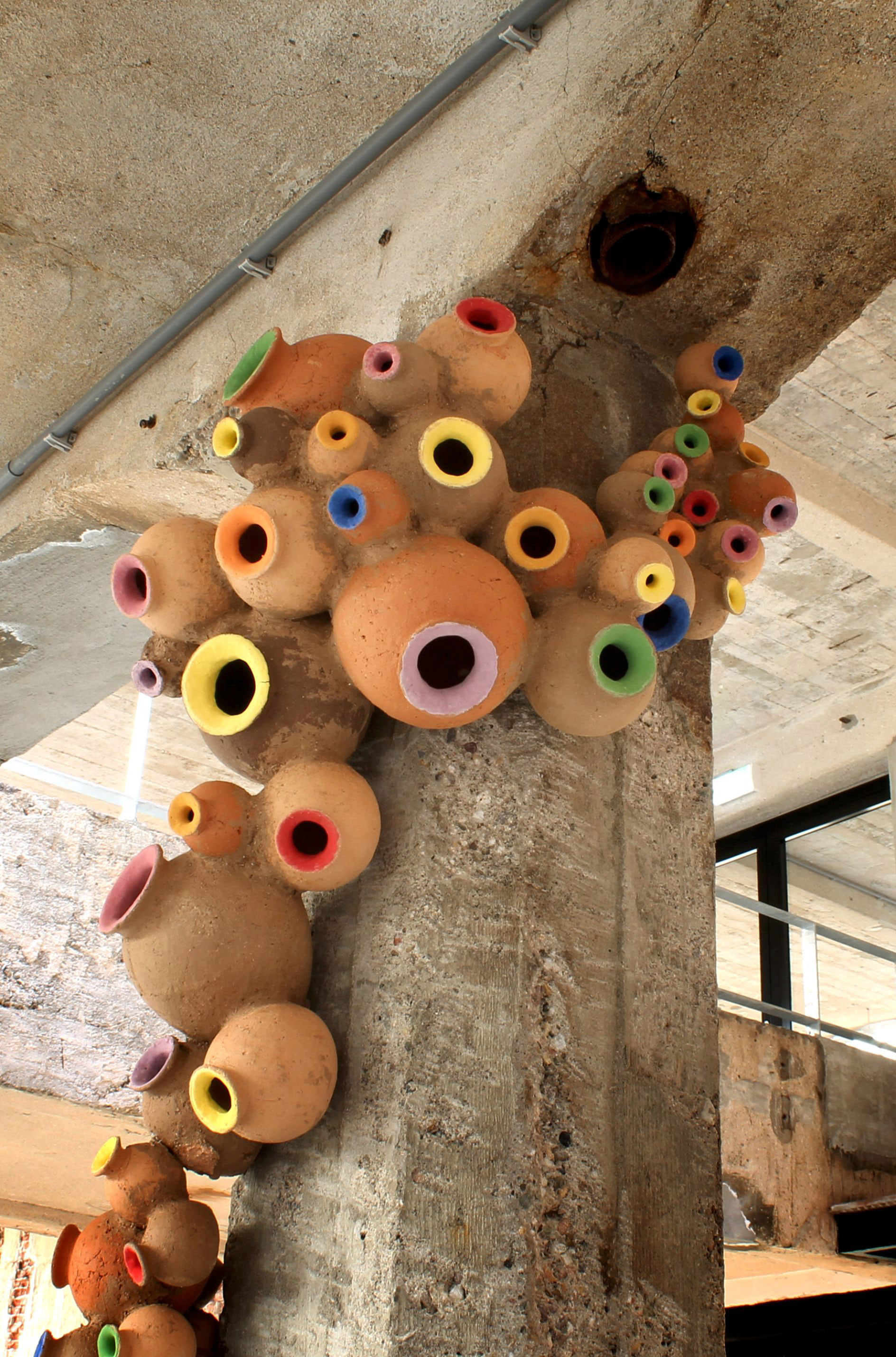
This piece explores the fine line between symbiosis and parasitism through the mode of ceramic sculpture. It is a ceramic sculpture wrapping around a concrete shaft meant to be seen as symbiotic as it looks as if its drawing life from the space. However, the aim of this sculpture is to pose the question of, is 'choking' the space and chaft; instead of enhancing light and energy it could actually be stealing it. In terms of the practical work, she has used red terracotta clay combined with vibrant underglaze on the rims. I greatly admire her ability to create something that provokes such subtle thought about contrasting perspectives, looking at how the meaning and relationship within the space can change depending on the person viewing it. I also like how she has reworked the idea of a traditional ceramic vessel form and translated it into a much larger sculptural piece that conveys such a complex message. I have found it very valuable to look at Mato-Mora's work as it has opened my eyes to not only how symbiosis can be translated into an artistic mode but showed me how ceramics can be used as such an effective method of conveying a specific message without writing it on the piece. This has also opened my mind and made me realise that in these past few weeks I have been working on physical scale(throwing) of my work, but actually could I improve scale in a broader sense? perhaps in a larger and conceptual sense?
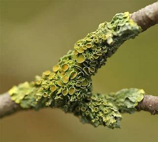
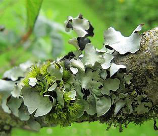
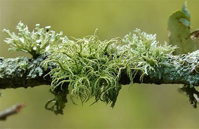
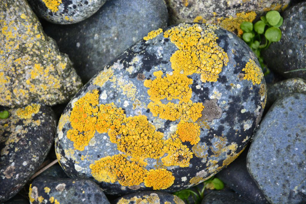
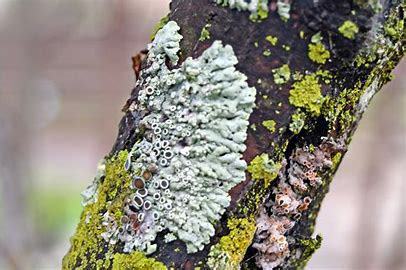
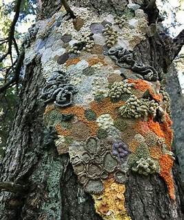
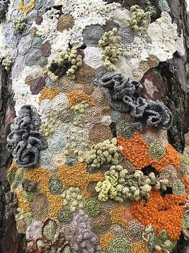
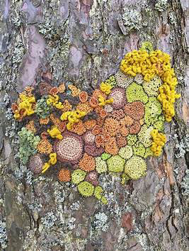
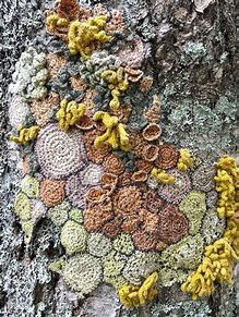
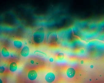
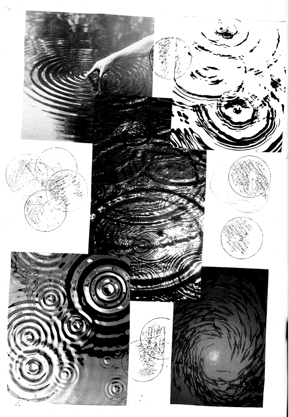
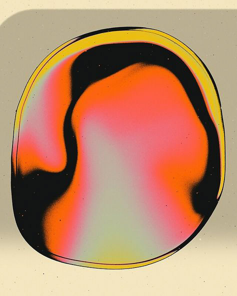
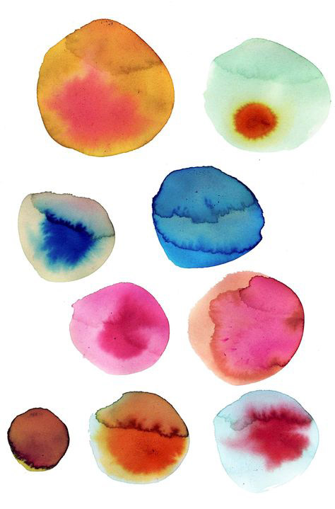
Inspiration Research: Lichen
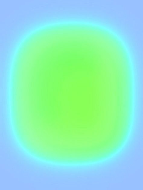
When researching about different types of symbiosis and its examples, I came across a well known type of symbiotic organism called Lichen. Lichen is an amazing representation of symbiosis as it itself is a mutualistic relationship between a fungus and a photosynthetic partner which in this case is an algae or cyanobacteria. The fungus offers the form and structure and then the algae or cyanobacteria offers the nutrients and glucose through the process of photosynthesis. In this relationship, they both equally benefit each other hence why it is a mutualistic; meaning that both have role that works in harmony with each other to gain mutual success. While the algae provides the nutrients the fungus needs, the fungus is highly absorbent so it aids the water retention of the organism whilst also acting as a shield for the extremely light sensitive algae. As soon as I saw images of lichen, although I had seen it many times before, it is almost like it clicked something in my brain. I realised that it gave me such good inspiration for my practice now that I can see it through a new contextual frame. See below for images of lichen and then annotated images showing my thoughts below:
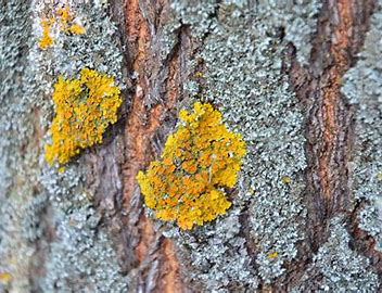
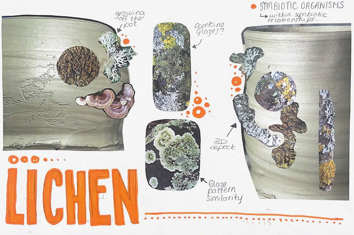
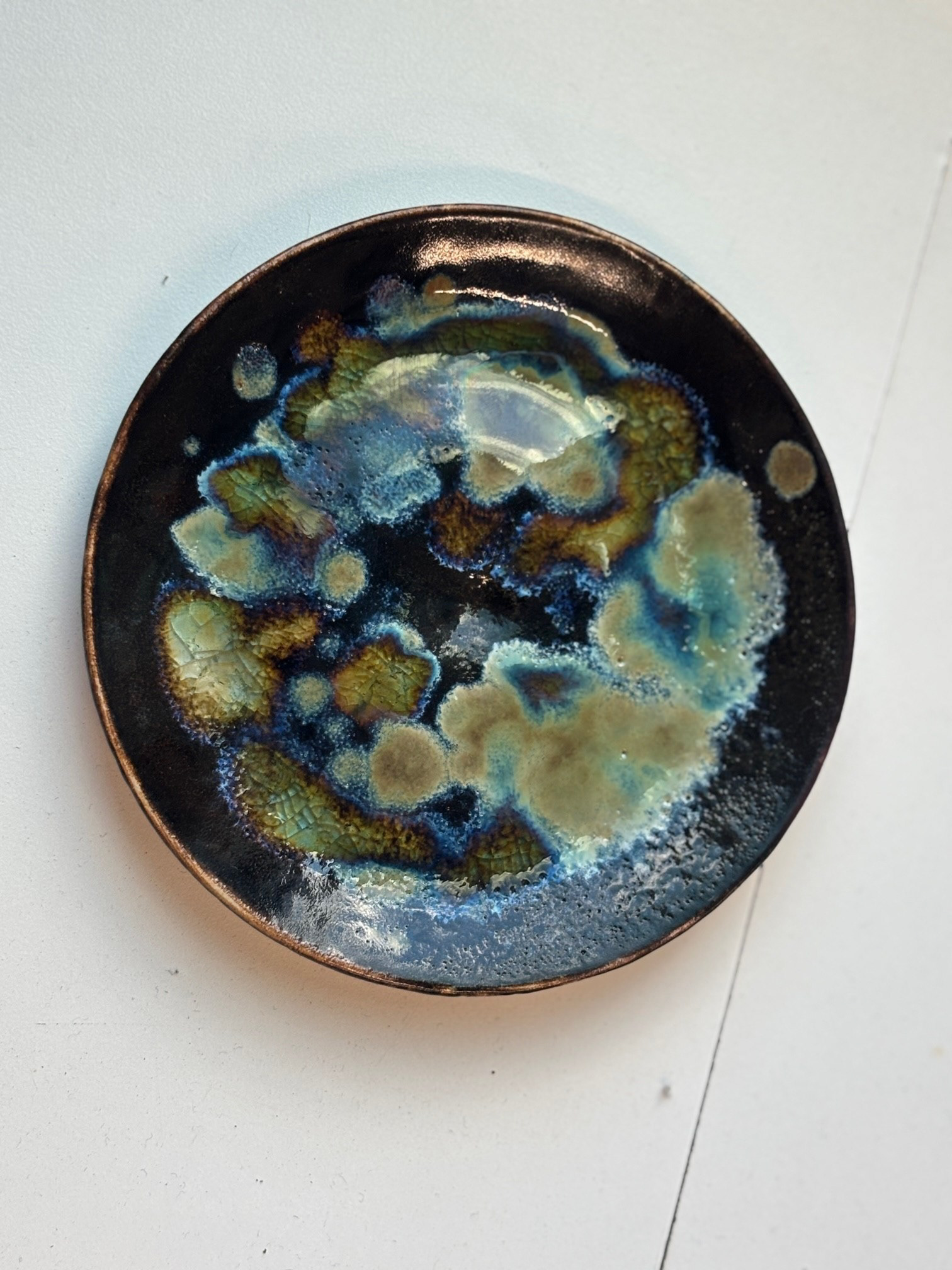
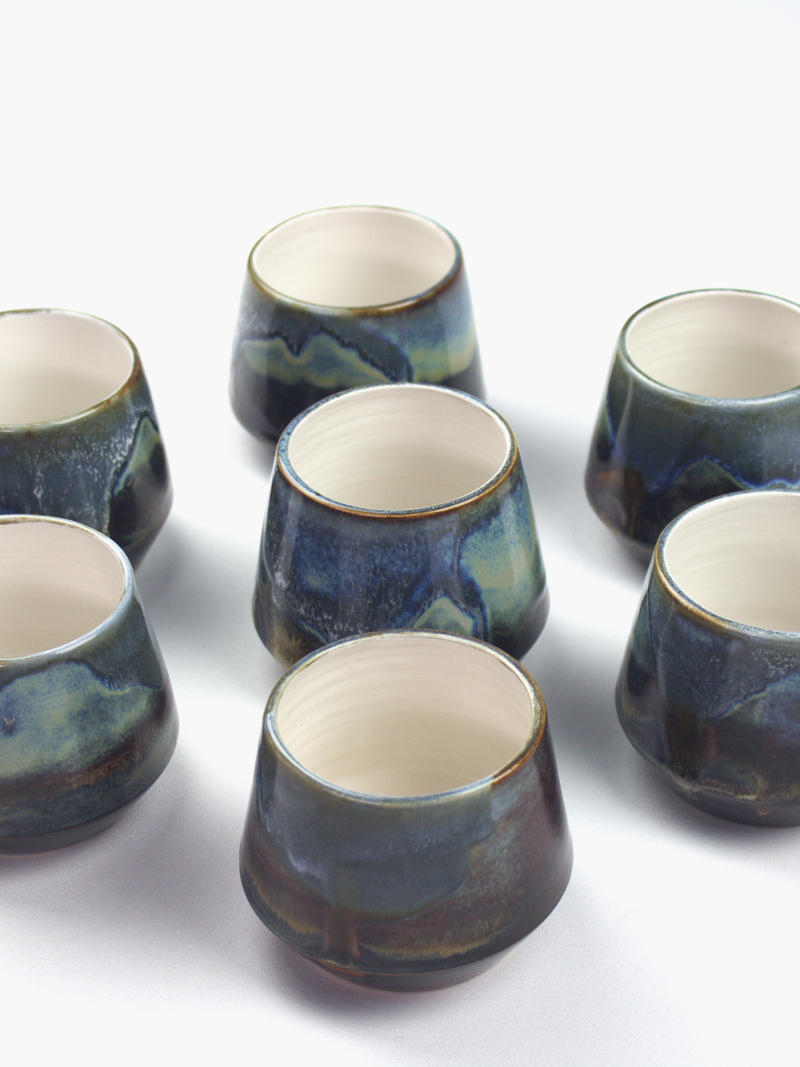
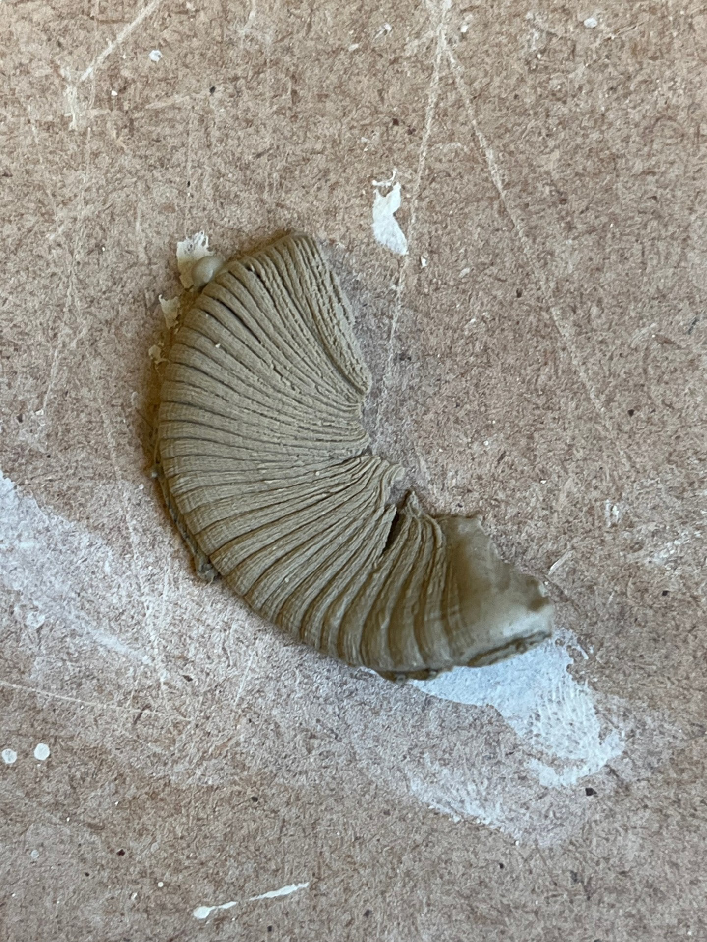
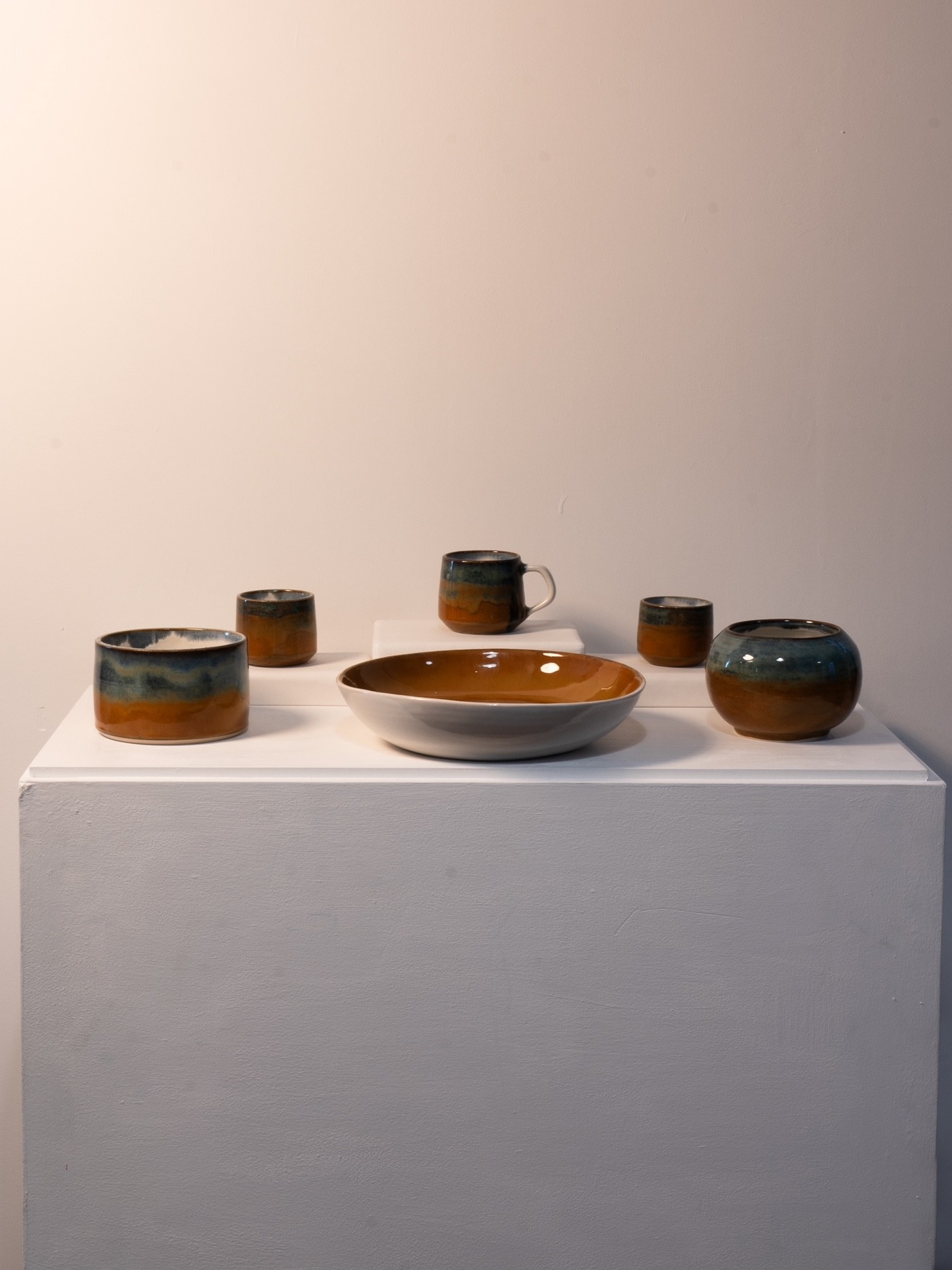
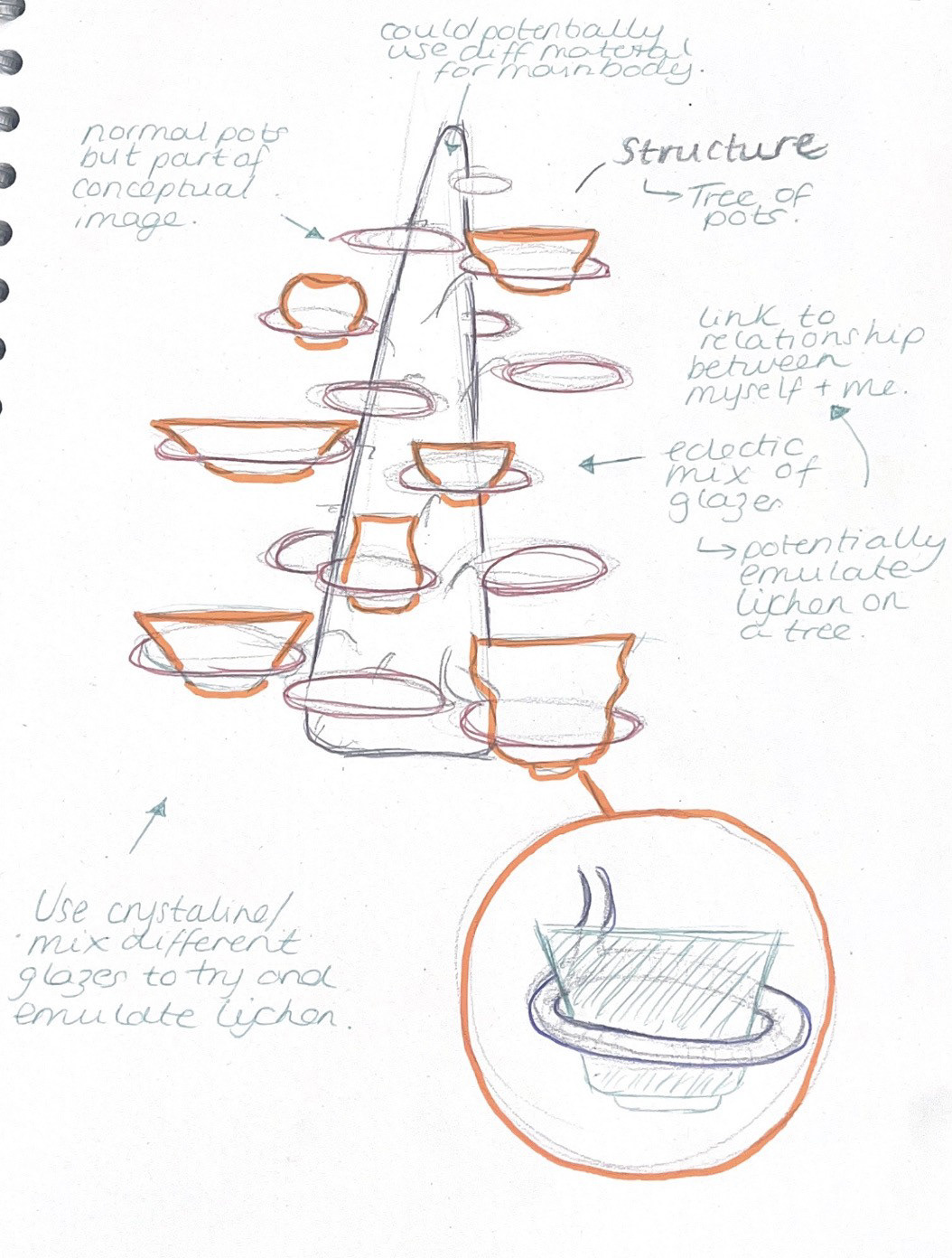
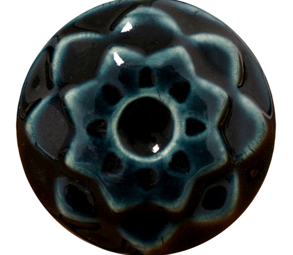
Sample made during beta project that resembles lichen. Made using a crystalline glaze.
Hannah Streefkerk
Hannah Streefkerk’s artworks are nature-oriented, inspired by natural elements such as water and land formations, trees, flowers and rocky landscapes. With a certain sensibility towards rhythms, structures and patterns, she extracts the essences of various forms in nature and translates them into site-specific works of art. These pieces are inspired by symbiosis of organisms and and are shown through the medium of textiles. I greatly admire her work because it offers a new way of representing symbiosis of nature by fusing her textiles directly to the tree itself.
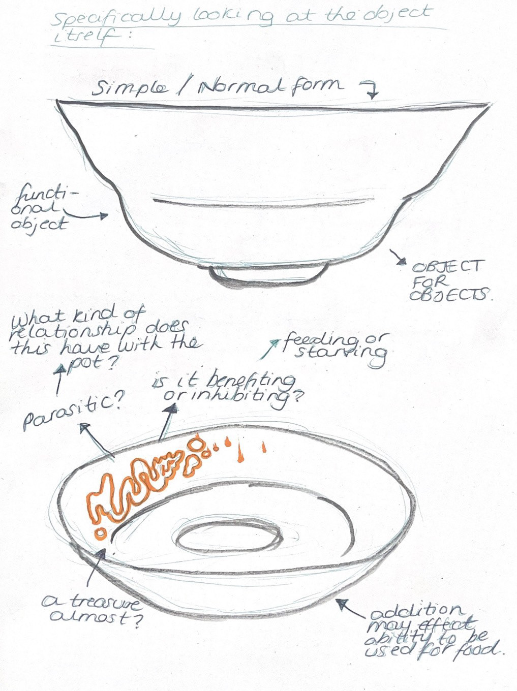
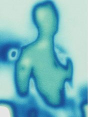
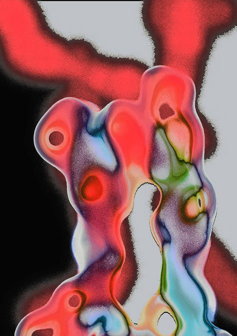
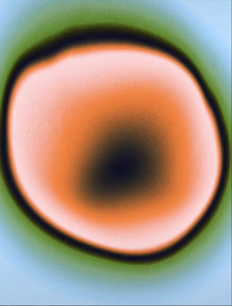
Following this research, I wanted to do some sketching with help of inspiration from artists and feedback that I have received. Up until this point I have had a lot of interest in the development of my current ideas but something about this practical avenue just wasn't ticking the boxes in my head. I noticed this because I naturally started to lose steam, I started to lose my drive and motivation because the direction itself wasn't motivating me. This is when I decided that I should strip the whole thing down to the bones so that I could really see what was underneath. By working on relationships and connections throughout this project, I have realised that there has been a reoccurring word, whether its on here or in my head, and that word is perception. It is this sketching that has made me take a step back and realise that it is not this specific idea itself that excites me but it is the role of perception and how the meaning of an object doesn't have to be concrete, it can be a fluid notion. For example, I really love the idea on the right because of the interrogation I was able to create surrounding the relationship between object and addition. The narrative that I was able to build by annotating the idea with questions like, 'is it feeding or starving?' and 'parasitic?' , was something that I really find fascinating but at the root, it relies on purely human perception as the true answer to each and every question.
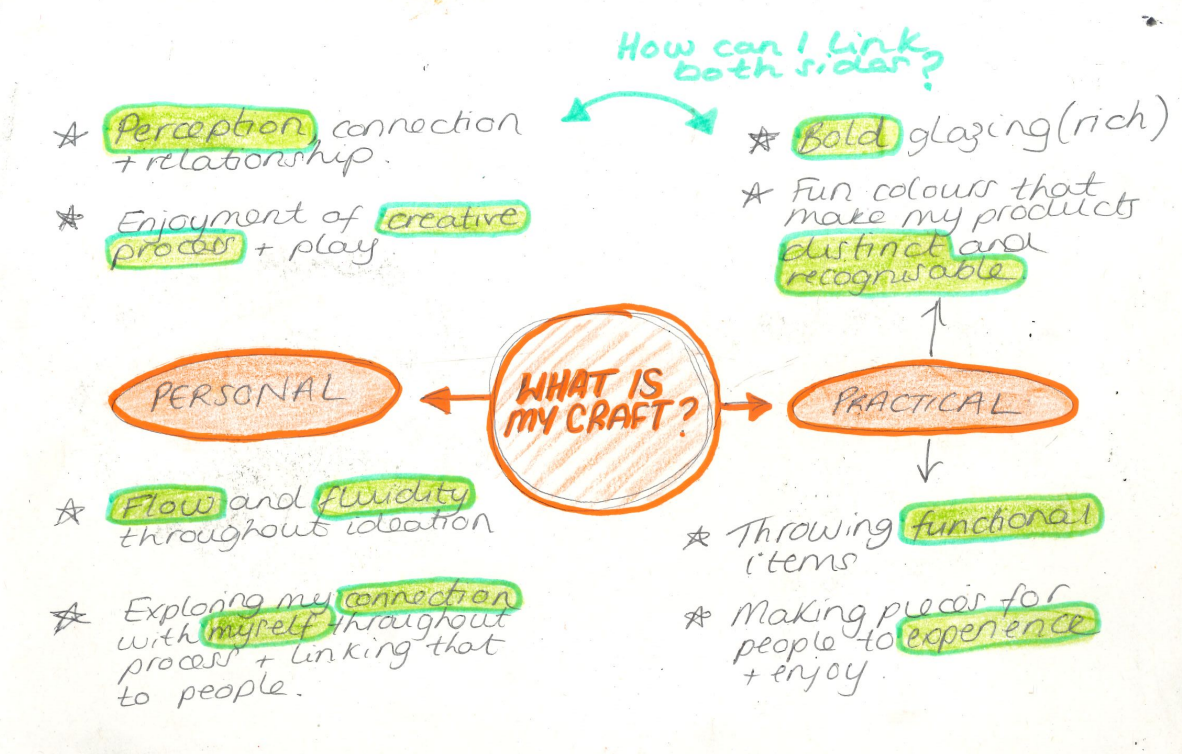
At this point in the project, I have made quite a few realisations in terms of my personal practice. This is why I have decided to break down those thoughts via a mind map with the aim of understanding, or reminding myself of, my core motivations. This is something that I will definitely be looking at throughout the rest of this project and I will be asking myself the question of how those two elements, personal and physical motivations, can work in harmony so that both can be considered to better my personal practice.
Idea Generation:
Throughout this project, I have been trying to think about what I could possibly do to level up my craft. The one thing that I know is that I don't want to introduce any new elements to my making, only refinement of my practice. I am choosing to take this route because I have realise that as a maker, my passion is throwing and making bowls., its as simple as that. I have recognised that that is my passion and the thing that I naturally stive for is just simply refining that practice and honing in on my skills. Hence why I want to try and introduce another level to my practice and I think that this element could possibly be achieved through collaboration.
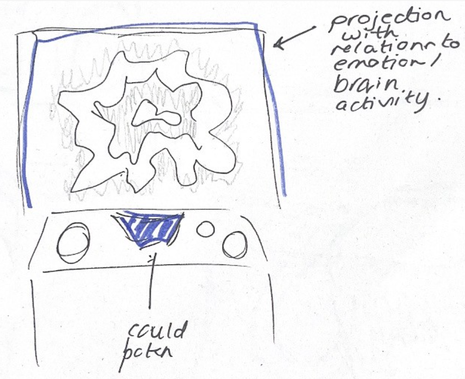
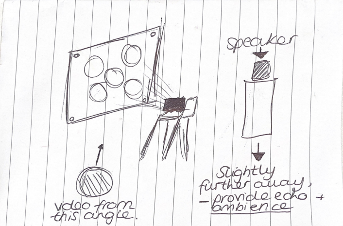
This thought process is what led me to the idea of possibly using some form of projection to enhance my piece. The idea is that the projection will be a programmed projection that responds to either pulse rate or brain activity. I could possibly use a brain or body sensor to monitor someone's body while describing and feeling my pieces, for example, when they are asked to describe my objects using adjectives and associations. I could then potentially transfer those reactions into visuals to go alongside my piece. The pieces themselves would be rather simple in form but would have glazes that are informed by my personal design motivations like nature and organic matter. Overall, the point of this would be to focus on and enhance that idea of connection between object and person; giving them the ability, in theory, to physically see what is going on inside their brain in relation to the descriptive words and associations.
Practical Research:
At this point in the project, I have gotten to a point here I am really starting to think about what I am going to do after university which is why I am trying to focus on analysing what craft means to me. In the previous mind map, I identified that in terms of practical, I am passionately drawn to bold glazing. Colour palette wise, I have always had an affinity for colours that remind me of nature, for example, shades of blue and green. I think that I naturally gravitate towards these colours because I love nature. I am draw to nature because of its inherent beauty and its calming abilities, in my personal opinion. Hence why I think I am going to naturally towards those colour glazes. For now I am going to research into those types of colours because i know that it is something that I will gravitate towards after university when I begin the growth of my personal independent practice.
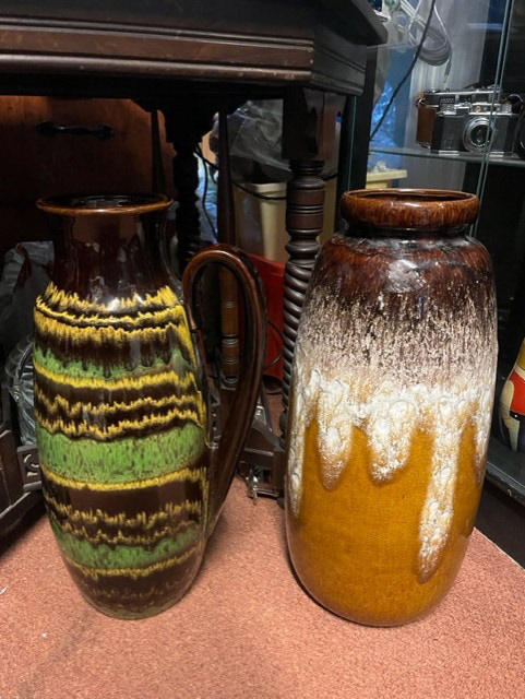
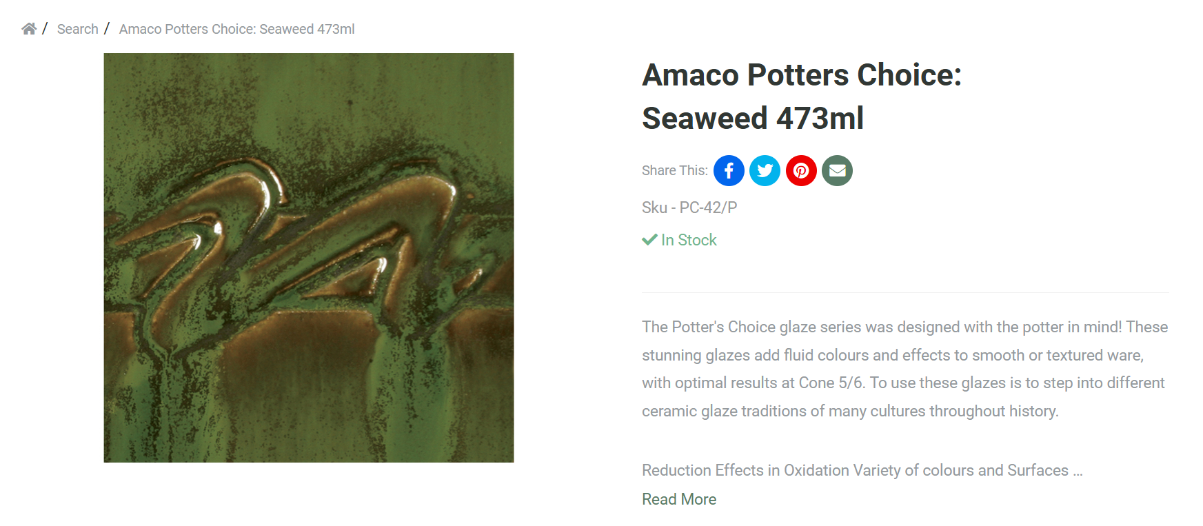
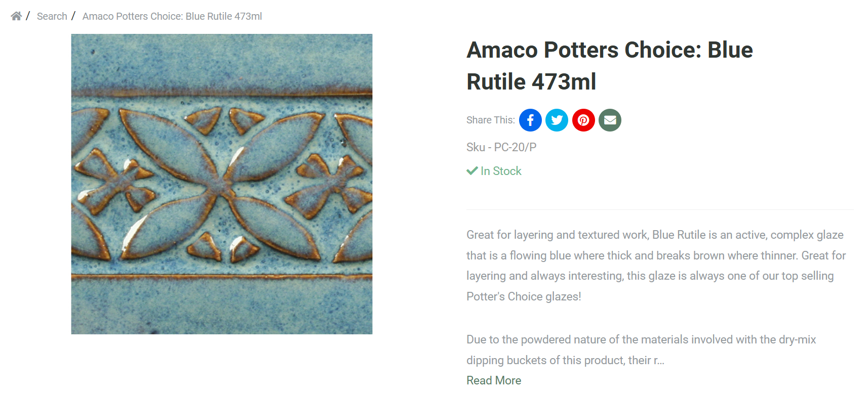
In Beta Project, I discussed my linking to pots that I found in my local Antiques shop because of their bold colours and I liked the idea that the glaze has a sense of movement attached to it. The glaze wasn't just glaze, it had something more about it, whether it was subtle or undeniable. Going into my glaze research, i really wanted to have these present as a reference and representation of what I love about glaze.
Glazes Im interested in:
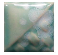
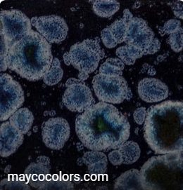
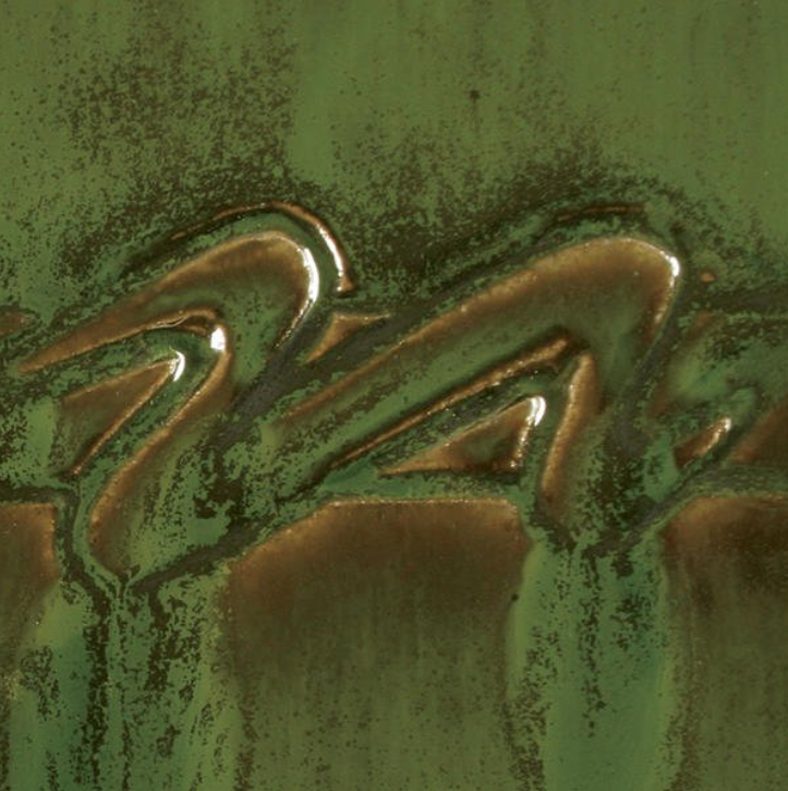
Images found from the Potclays website:
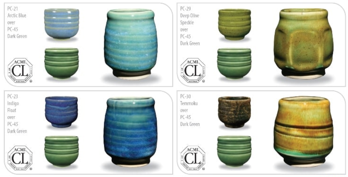
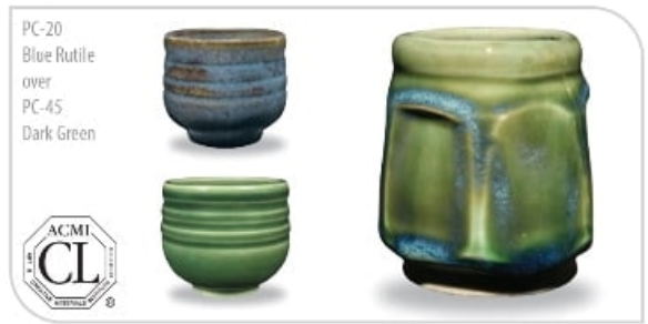

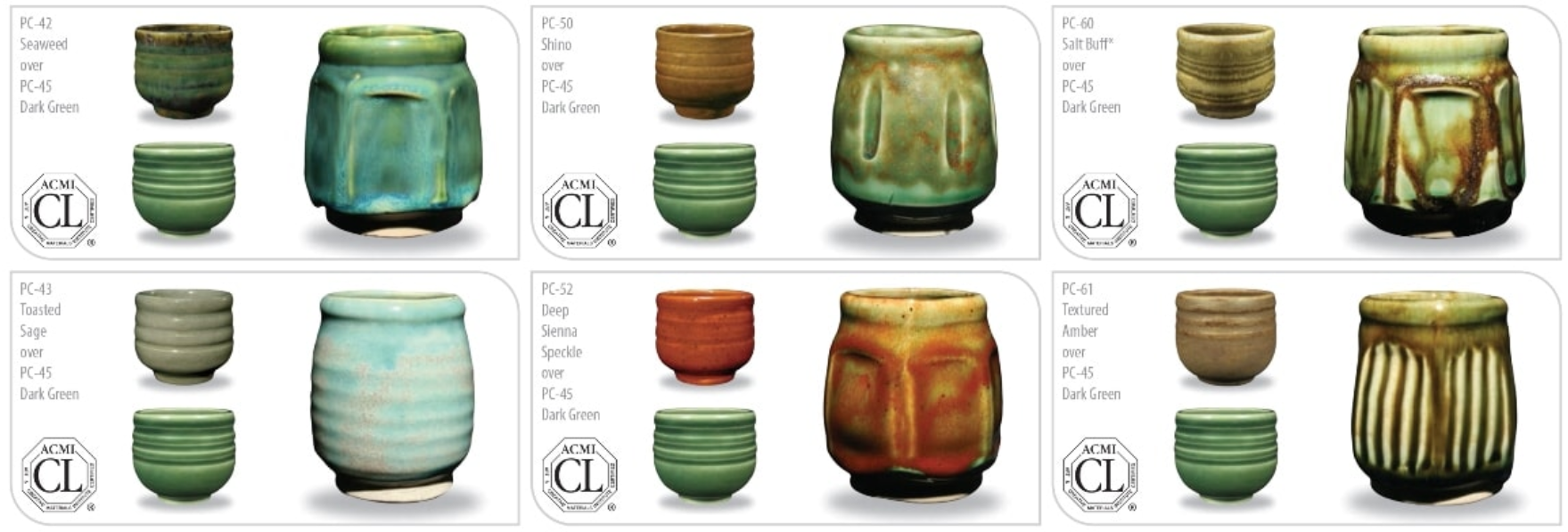
Glazes I chose after research:
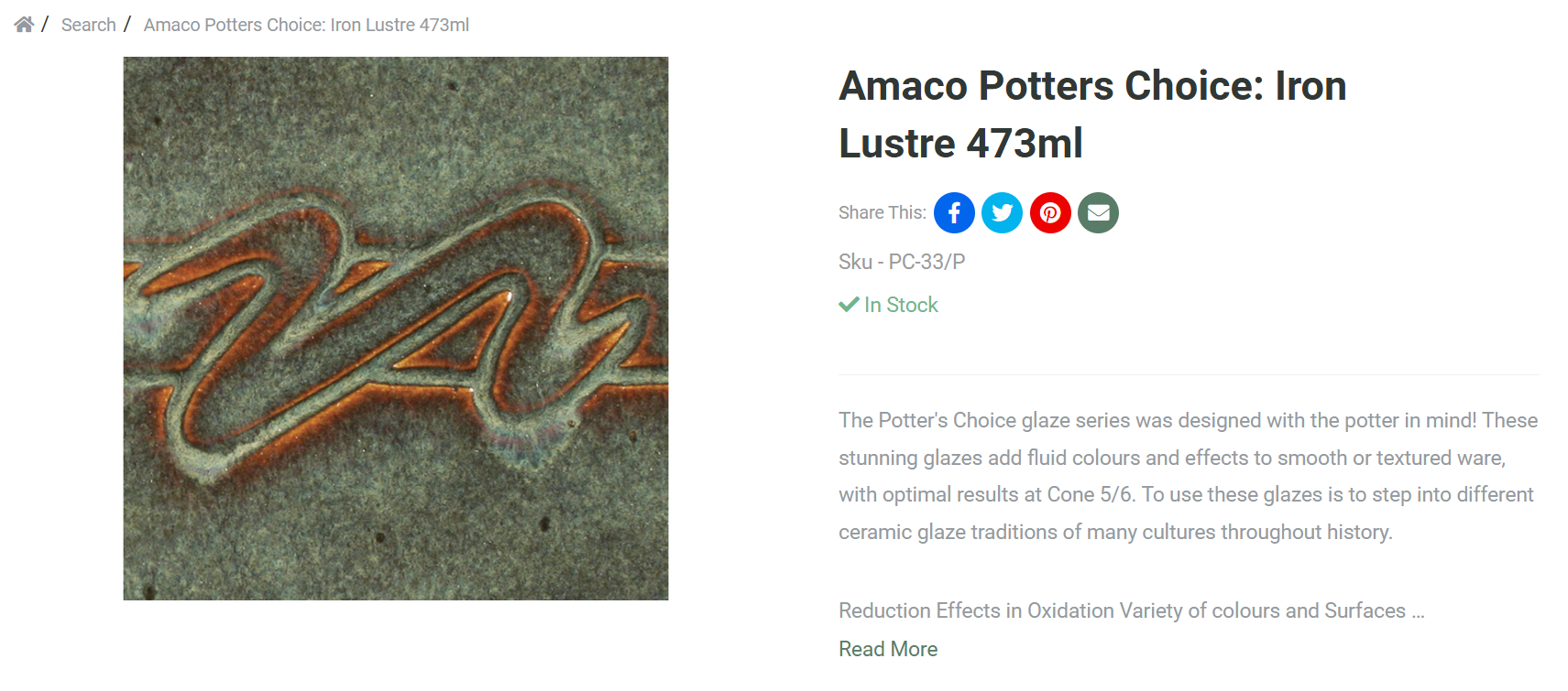
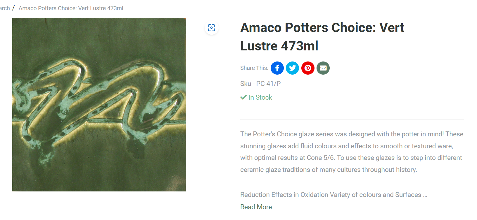
I chose these glazes because they were the ones, if featured, that had the preferred combinations in my research. I also just kind of rough balled it somewhat because I looked at how the glazes sat in the image etc and was eager to see how they reacted with each other.
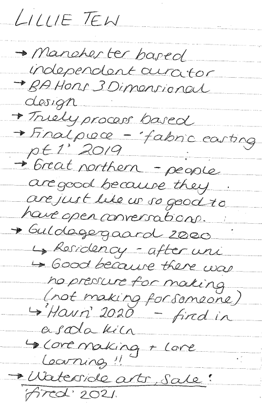
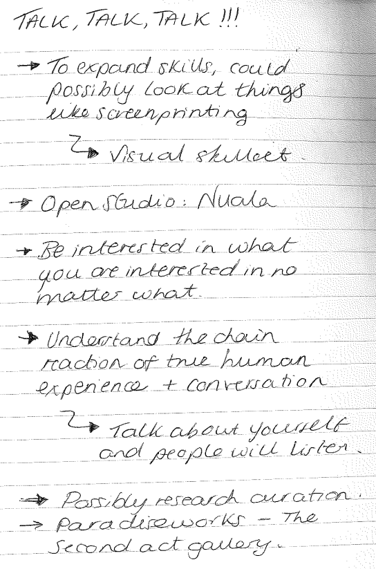
Notes from Lillie Tew Visit:
Idea Development:
I have decided to take the idea of introducing a projection element forward in this project because it is an avenue that really excites me. I know that my practical interest in craft is rather simple because that is the area that I would consider in the realm of ,y personal expertise; however my thought process was, 'what is something that I'm not the strongest in?' and that led me to introducing the digital element to my ideation. I'm not very good at computer based work, howver introducing this into the collaboration element could allow me to learn something and broaden my practice further.
I want people touch, feel and experience my pots while also being presented with visuals that could be creating what is happening inside their brain into a tangible projection. I want to create a space that allows people to experience their intangible emotions being made tangible! Overall, with this idea I aim to create an experience that enhances the people’s connection to not only my work but their connection to themselves by allowing them to actually see a visual process. As a whole linking this to my longing to understand the workings and connections to my own brain. I want to explore this because I think that it will elevate my work and make it something so much more than just 'a bowl' or 'a vessel'. My rationale at this point in the project is that I want to physically work on something that I will be able to and want to carry on with after university life; so I'm going to use this opportunity to really focus on refining my physical output of this process. This is why I am going to use this collaboration to expand on my narrative behind this project so that I can push the boundary of my work further and expand on my idea of relationships and connection.
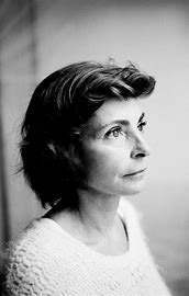
Artist Research: Ann Veronica Janssens
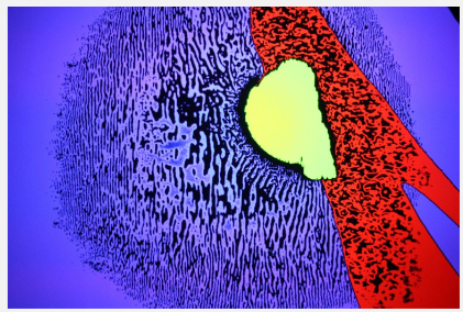
Going into my projection development, I wanted to complete artist research with the hope of it influencing elements of my practice whether its physical of purely just to enhance my understanding. As a designer, I am interested in the role of perception and human connection which is why I have found Ann Veronica Janssens. Ann Veronica Janssens is a designer from the UK who is based in Brussels, Belgium. She is an experimental designer who specialises in projections, installations and experiences that are influenced by her like for the intangible, such as light and sound. Her work creates a sensory experience that focuses on the perception of the illusive and aims to blur the line between what we know and what is perceived. She embraces and interrogates the fragility of perception and what the word reality truly means. In the Image labelled 'yellowbluepink', she filled a gallery with fog and then manipulated it with different coloured light, playing with perception of depth or detail of the room.
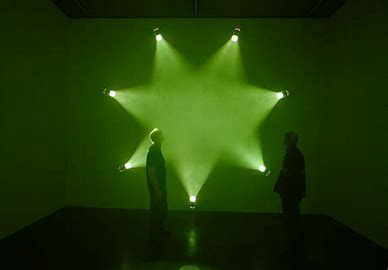
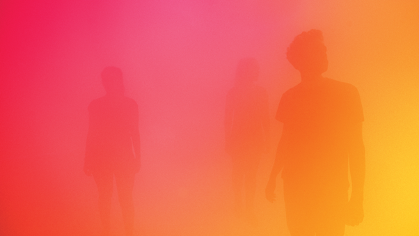
Yellowbluepink (via Wellcome Collection)
I greatly admire her usage of light to influence physical perception as it turns the focus on the people and makes them the object of the art and not just the art itself. Allowing perception to play a large role in her work is something that adds greater depth and enhances the connection that people have with her interactive experiences as well as highlighting the true beauty of the human experience. I also love her expert usage of bold colour as it really captures the attention of the user. This research has been very valuable as it has allowed me to understand how another person translates the idea of perception into their work, and making that an immersive experience that focuses on people; so I think that I am definitely going to consider her work when developing my ideas.
Meeting with Gemma Potter & Ideation in response:
We had a talk with Gemma Potter who is an individual that works at the university who specialises in fusing traditional crafts with modern technology through the medium of interactive social experiments. From listening to what she had to say throughout the talk, I decided to stay behind so that I could pick her brain about how her knowledge might be able to apply to my projection idea. On the left is people and points for me to research that could be relevant to what I am trying to achieve, on the right is some initial research I and ideation I did in response:

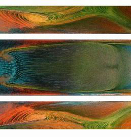
Drawing inspiration from oil projections:
INGRID MURPHY
Is the academic lead lecturer for Transdisciplinarity at Cardiff metropolitan university who specialises in ceramics and craft theory. More specifically, Murphy investigates digital fabrication processes and focuses working that into the notion of augmented reality. In 2008-2013 she lead the ceramic department at Cardiff met and form 2011-2016 she lead the Artist, Designer: Maker course which was a cross-disciplinary course that focused on combining traditional craft skills with digital design and fabrication.
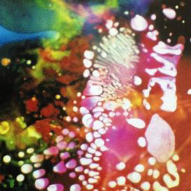
SAM MEECH
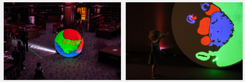

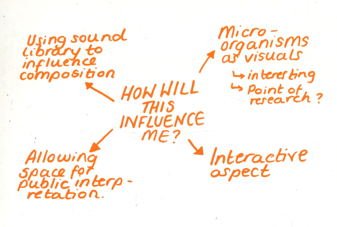
This piece uses digital media and the art of projection to show an evolving organic interface that recalls the behaviour of micro-organisms in a petri dish. This is an interactive interface that welcomes public engagement and interpretation which enables the projection to grow and respond to physical feedback. The forms or 'organisms' represent not only the interaction between the coloured video forms but the interplay of the users and their perception. I admire his ability to transform something that cannot be seen by the human eye into a large scale piece; transporting the viewers into world that no one gets to experience in everyday life. Meech really focuses on the idea of audience interpretation within his work and that is something that I have always loved when looking at my design rationale. Even before truly understanding what my practice was about, I have always had the intrinsic drive to create objects that evoke subtle thought and imagination in the user; objects that have a function or aesthetic that can be bent to the users personal desire, allowing them to have a perception that makes an object truly theirs.
I think that overall, there are a few things that I am going to take forward, in inspiration, from researching Sam's practice. The main aspect that I want to keep in the back of my head when continuing this project is how he used micro-organisms to influence his work. This is because it has not only created a beautiful organic and morphic visual, but it has captured part of a world that can only be seen through a microscope and transformed it into something that we can see, influence and experience; also linking in my love for the interactive aspect.
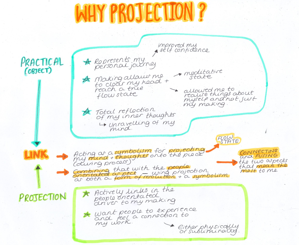
Going into this further development of my projection idea, I wanted to provide some context behind the projection and show why I chose to use projection. For me, the projection can link to the two most important aspects of my making, acting as a form of resolution and symbolism. The resolution provides physical context, linking in the people orientated interest in my making. The symbolism comes through my approach of using the creation as a means of expressing my inner thoughts, transforming my practical craft into a projection of my mind onto the material world.
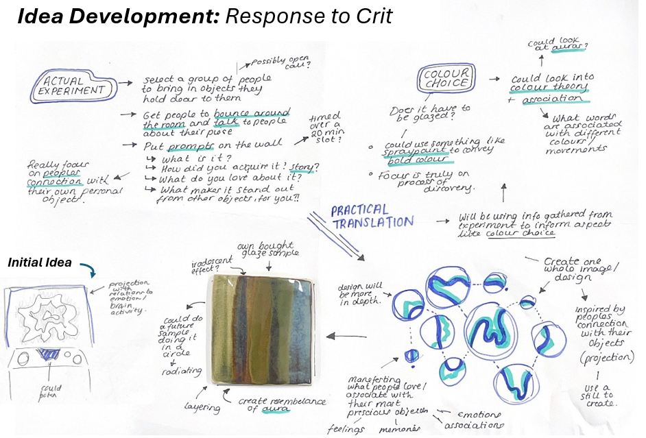
In the crit, I put across my idea of including projection and collaboration in to my idea as a design element. Initially my idea was to use the projection itself to describe how someone feels about my pots. However, feedback from Geoff suggested that it would be a lot more interesting if the projection directly influenced the finishing of the pot instead of after. This idea would allow for the finish of the pot to be informed by something more concrete than just my personal interests and affinities. Throughout the duration of my crit, I was able to come up with the idea of using verbal audio of what people like about their own objects, whether its a family heirloom or their favourite mug, and discuss in a room with other people. That audio of the discussions would then influence the projection as it would be a projection that is responsive to the sound of the multiple conversations. The room itself overall should be filled with about 30 people and I aim for it to sound like a café murmur. I also was recommended to look into things like colour theory so that I can build up a good base of research for the colours I chose to use and what effect they will have on people and how they perceive the piece. Overall, the main takeaway from the crit is that since this workflow will be influencing the final output of my piece, it needs to be the main priority because this could be detrimental to my completing of this project.
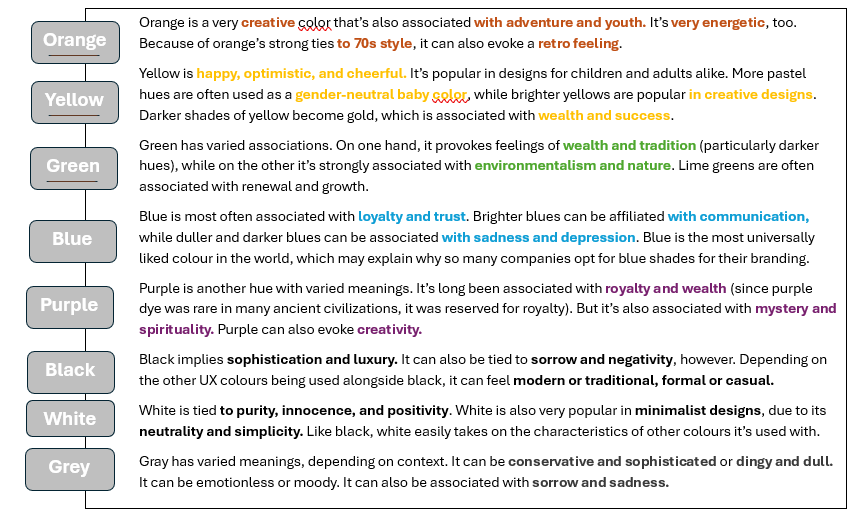
Colour Theory
Colour theory is the study of how colours work together and how they effect our emotions and perceptions which was a term first coined by Sir Isaac Newton. Newton established 3 basic categories of colour: Primary, Secondary and Tertiary. The right contrast in colour is important in design as it is vital for catching users’ attention especially when it comes to actually wanting someone to invest in your designing. Colour can also sometimes even evoke different forms of emotion and factors such as gender, experience, culture and age can affect a person’s choice in colour as well as their susceptibility to the effects of certain colours.
In relation to colour and design, people’s expectations can be a large factor when considering colour as individuals within our society build an idea of what a design in a certain industry should look like. For example, most banks in the west have an affiliation with the colour blue because it has positive associations in other cultures. In this case, blue is widely associated with Loyalty, Authenticity and trust among many others. Some brands can also intentionally use the same colour as their competition as it breeds the idea that the competition isn’t special; making sure that they are both being seen on a level playing field. However, colours can contrast sometimes in their associations, especially when it comes to global cultures and nationalities; for example, in China, red is seen as a sign of good fortune but in south Africa it is seen as a sign of mourning. Usability testing can be a good way of establishing a good idea of user perceptions and preferences when it comes to colour design so that is something that I could potentially consider later down the line once my idea and prototypes are physically formed.
Information from 'Toptal: The role of colour in UX' written by Cameron Chapman formatted by me
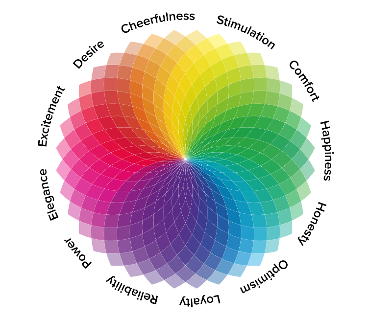
Using (source name) I was able to find out about types of colour and how they can effect your perception and emotion. On the left is a colour wheel that shows the basic emotions behind the colour theory wheel, its not scientific but it acts as a good example to get the basic idea of psychological colour theory. On this wheel, I am particularly drawn to a few of the perceptual emotions in the cooler section, those being optimism, happiness and comfort. I think that I resonate with these words because these emotions are what I aim to channel about my own inspirations and feelings towards ceramics. As a potter, I gain so much happiness and comfort from ceramics because it acts as a mode of expression for me that I have never had before. Having such an efficient outlet for my mind has allowed me to get a full understanding of not only what makes me tick but what elements of that I want to radiate through my work for other people to experience too. See below for further information I found around colour and balancing from the same source:
Above: Extract from source of a simple question that is channelling the type of thought I want to evoke.
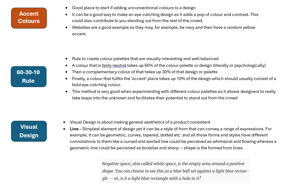
The research above took me to looking at the balancing of colours and how colour placement and palettes can be used in different ways to catch user attention. Accent colours can be a good way of attracting people to your design as the pop of colour could make an object stand out from the crowd. I think that this is an interesting concept that I could potentially consider in future as there is much research corroborating this theory when it comes to design; so therefore it is a very trusted theory. This page also opened my eyes to the world of visual design and how that could possibly play a part in my designing. I like the idea that this source proposed of thinking about a simple line and how even the smallest thing can effect someone's perception if a design or in this case object. I really resonate with the idea of visual design, more specifically the example that this source proposed, because it really focuses on the role of perception. My personal schema of designing has always come back to my love for allowing the meaning of a design to somewhat be in the eye of the beholder. I have always said that I don't want to label my pieces and say, for example, 'this is a cereal bowl and it must be used for cereal', I want people to be able to make my piece what is right for them. This not only relates to function but also my style of form and surface design; creating something that is simple yet subtlety thought provoking, carefully placing the questions of meaning and association into the viewers mind.
The Role of Colour in Human Perceptions
Many artists and designers have believed for a long time that colour can have a significant effect on our moods and emotions and can be used as a powerful communication tool that could goas far as influencing our deepest psychological reactions. Colour can be a powerful indicator on what makes someone tick as something as simple as colour can affect things like what we wear and the objects we have around us, which may seem like quite simple things however when you think, they play a large part in our everyday life. People use colour as a vessel to convey parts of themselves that they hold paramount to their identity, for example: someone who choses to surround themselves with autumnal colours with earthy hues might illude to their love for nature and the outdoors; like if someone might choose a specific item that conveys a sporty or futuristic sway to their personal identity and interests.
Within psychology, research into colour has suggested that colours have such a large effect on us that it can even be used to treat various conditions and influence our emotions. Colours within the red area of the spectrum, also known as warm colours, spanning over yellows and oranges are said to evoke a feeling of warmth and comfort but they can also sometimes facilitate feelings of anger and hostility. The cooler side of the spectrum spanning over purples, blues and greens are said to have a calming effect however it can also be shown to bring forth quite a sad and isolating emotions.
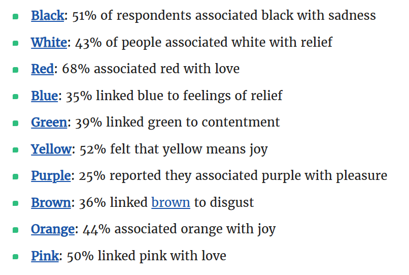
A study completed in 2020 surveyed emotional associations of 4,498 people from 30 different countries and found that many people had firm associations when it came to certain colours. Within my practice, I personally love working with shades of blue and green because I love how they make me feel when I look at them. For me, they make me feel tranquil as they remind me of elements of nature like the ocean and forests. I personally resonate with those as throughout my life, I have found such contentment and solitude in these places. Growing up, I loved being outdoors and the best place for me to be somewhere like the ocean or a forest as they both never failed to stimulate my mind and imagination, whilst simultaneously quietening my thoughts and making me feel so safe and content.
The Connotations of a Circle
What does a circle mean to you? What could a circle encompass? - created by me
Collage made by me in L5
Following the crit, I got some feedback from my peers commenting on the whole 'idea' of a bowl and what it represents so I wanted to look deeper into form and shape so that I can give context to what I am creating and why. After looking into visual design, it opened my eyes to the effectiveness of a simple line in facilitating diverse individual perception, which then lead me on to thinking about shape and how shape can be perceived in the same way. To begin, I thought a good place to start was by looking into a simple circle because I love throwing the fluidity of motion that it represents. Throwing bowls and dishes is something that I gravitate towards because I love the idea that a circle, to me, encompasses something. A bowl has the ability to hold, cradle and support things both tangible and intangible; a bowl can not just hold objects, it can hold memories, feelings and emotions.
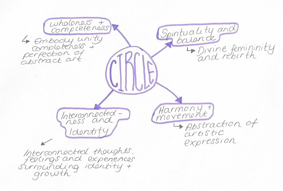
Circles have been used for many years as a vessel for expression through art and architecture. In art, circular motifs are used to convey harmony and wholeness within a given composition; like architecture where elements like circular or domed rooves are created and implemented to bring people together and therefore represent unity. Completeness is also represented using circles in both architecture and art due to its whole nature to further convey that idea of totality and continuity. Research into its historical significance shows that circles had a deep-rooted symbolism in community and connection within various global cultures.
Circles also have religious roots as they are heavily featured in many spiritual traditions as well as symbolisms such as the circle of life and death. Another example could be mandalas in Hindu culture as it represents the ‘cosmic harmony’ of life through its detailed designs. In a more spiritual and somewhat scientific manor, circles can also be linked to the association with celestial bodies and can highlight themes such as rhythm, cycles and balance.
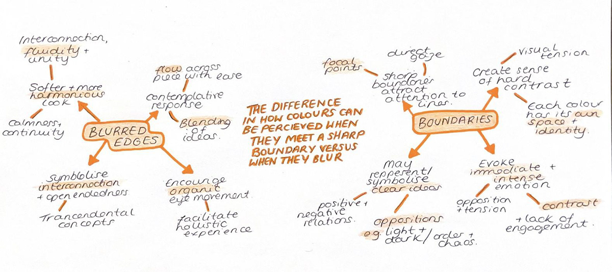
Is there a different in connection/ perception between colours that have boundaries (or edges) and colours that blur (e.g. aura)?
Personal mind map created through brainstorming
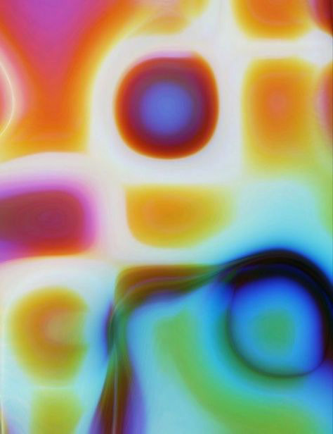
The main thing for me with regards to the projection is that it has bold intertwingling colours. As seen above, I think that having blurred edges between colours really symbolises interconnection and provides a more harmonious and organic feel to any design. In this case, i really want the colours to blur and intertwine, linking back to colour theory, to represent the fusion of emotions and perceptions. This fusion in itself can be a representation of the duality of a persons mind and self and how perception can effect something that personal and unique.
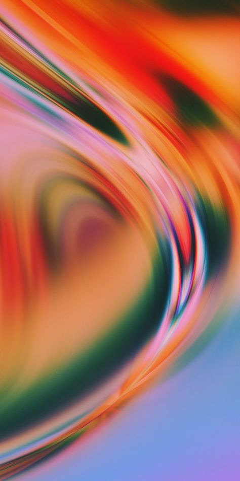
Visual/ Projection Inspiration
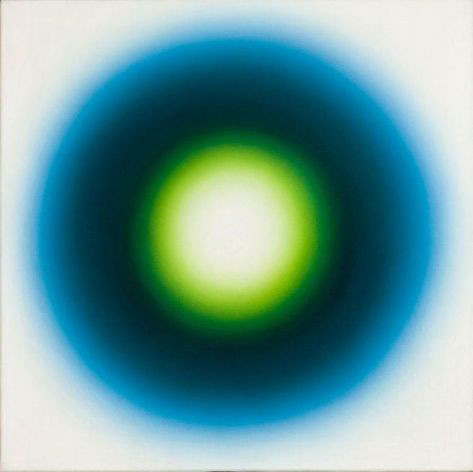
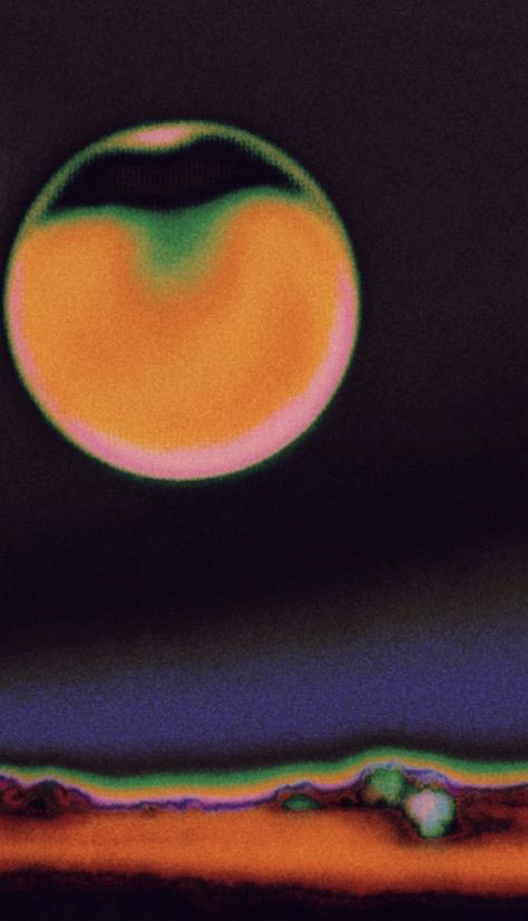


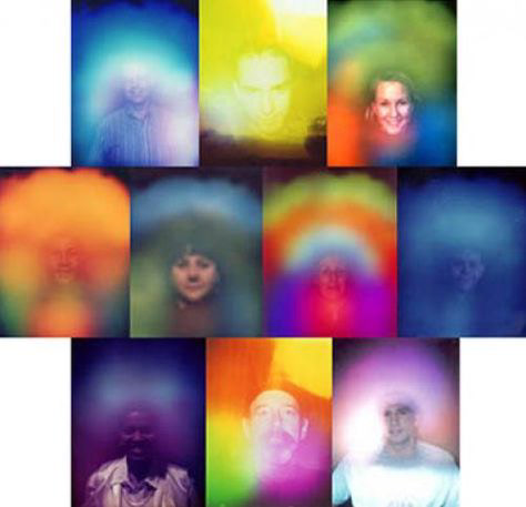
Further Inspiration: Human Auras

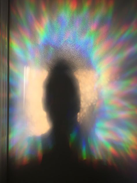
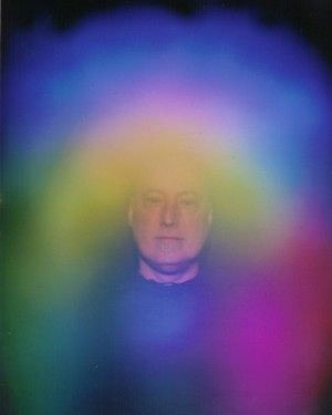
I personally like the look of these styles of form because I love their fluid and free nature. To me, when I look at an image like this I instantly feel warm as it reminds be of growth and almost has a calming nature to it. I think that this is the style of projection that I have chosen because this whole project is a reflection of myself, meaning that things as simple as my likes and dislikes are actually what is bringing depth and contemplation to this project. Throughout I have been digging deep and trying my best to reflect and really contemplate what makes me tick. In this project so far, there are a few key words that are consistent throughout my thought processes and throughout making have realised that these are my main drivers; even when looking at things like process and tactile skills. See below for the words.
This is a mind map that I made at the beginning of the year of just words that I felt represented my craft. Even now I agree with all of those words but I think that throughout this project i have been able to look so much deeper within myself and realise why I like these things. For example, a lot of these words have an element of freedom to them. I like words and things that have no bounds. Things like nature and fluidity because they represent something that isn't finite, something that is changeable, movable and free. Even with function, I have always said that I don't like to give pots a specific function but I have never truly known why but now I do; I just don't like restrictions. I want to create vessels that symbolise my heir for fluidity and freedom in various aspects.
Multimedia Sketching:
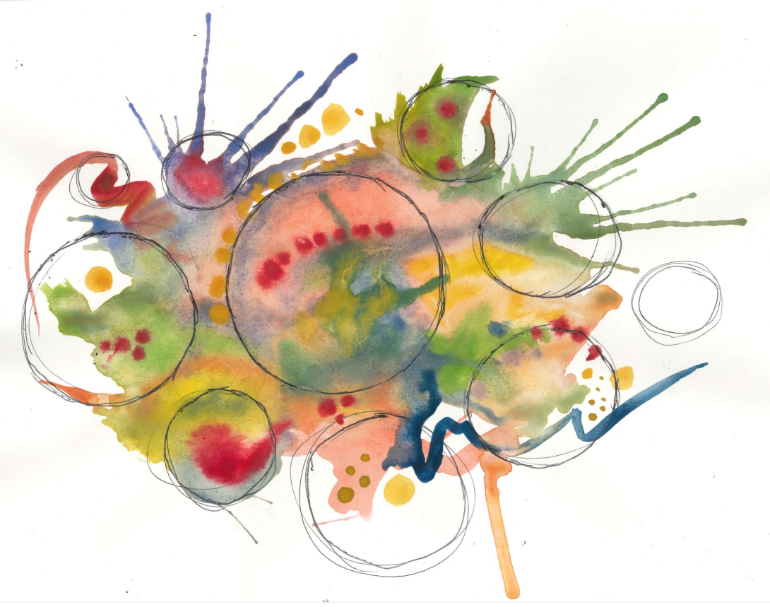
This is a paining that I did to provide a physical representation of what I was visualising in my head for the final output of this project. The watercolour shows the vibrancy and abstract nature that I want the projection to represent as well as how it will work when projected directly onto the bowls. See above and below for birds-eye view of bowls and projection:
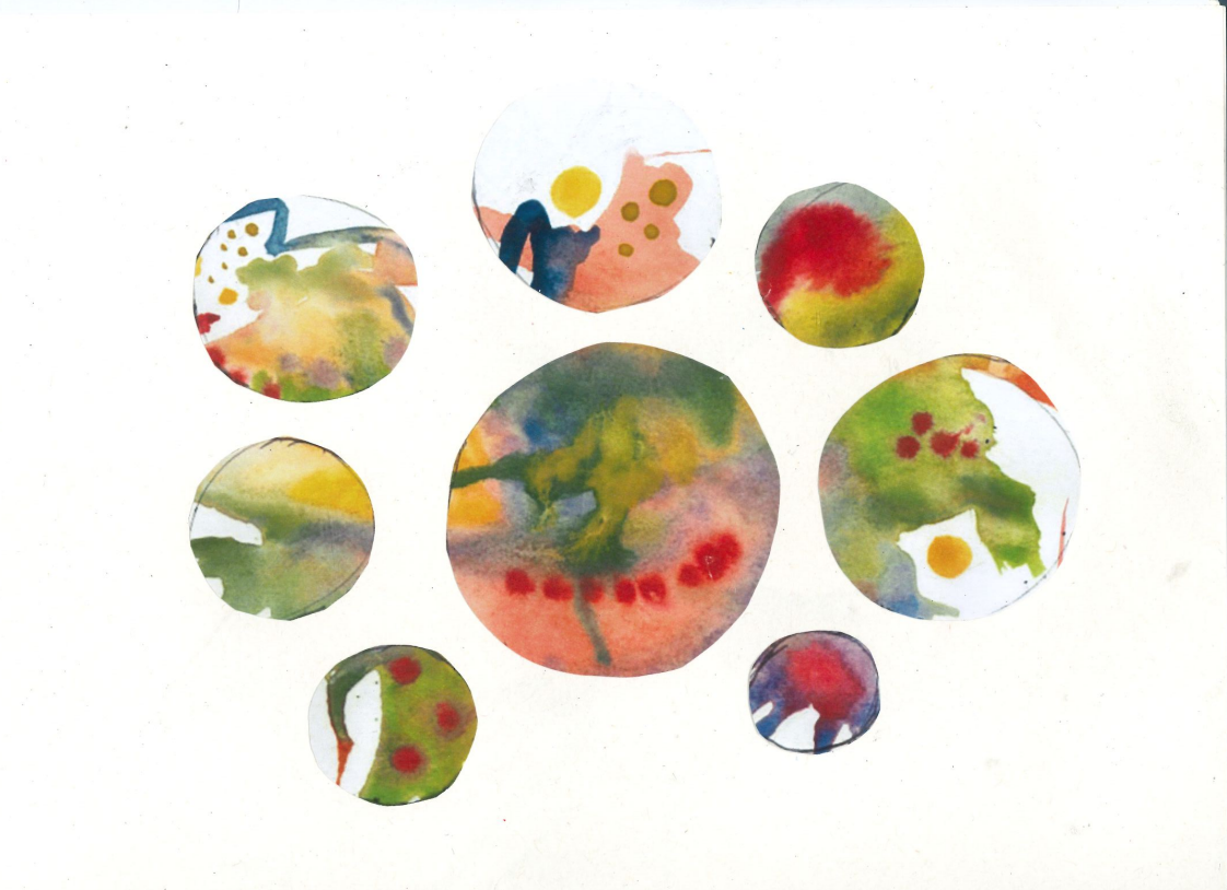
Comparison against initial sketch - Birdseye view of pots.
Formative Review Feedback:
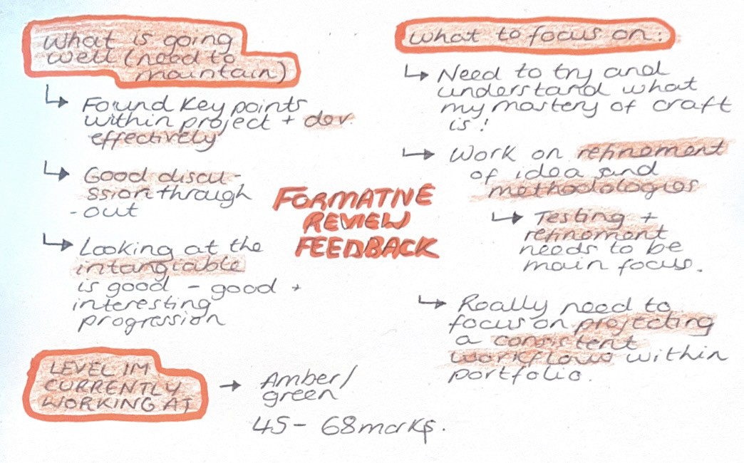
At this point in the project, I realised that I should really be focusing on what out of this project will be and what I want to be a deliverable. At the end of this project I know that I want to produce a body of refined work that is a reflection of the projection that I want to create. These are the two elements that I have identified as my main deliverables so I need to figure out how I am going to achieve and execute those for my final submission.
In terms of the projection, I think that this needs to be my current main priority because that is something that isn't just on my timescale, but on the timescale of the individual who I am collaborating with. It is also an element that I am adamant on developing for next term so I want to use this project as a form of testing and measuring success of workflow. For the sound itself, if I were to develop it further, it would be a personal experiment with a group of people having individual conversations about an object they hold dear to them. I would have two microphones, one recording the overall sound in the room and the other with me and I would be walking around the room picking up on peoples individual conversations. My vision for the overall sound in the room is for it to be similar to the sound of a warm gentle murmur in a café. As a whole, this experiment is not deliverable for this project however a form of sound is indeed needed for the projection; so I had the idea, with help from discussions with tutors, of using a pre-recorded sound of a café to represent the experiment sound that I will be producing in the next project. I believe that this is necessary because my main priority right mow is the projection and to achieve that, because it is a sound responsive projection, I am going to need some sort of audio to create it.
To develop this further, I decided to have a chat with Geoff to see if this was an achievable avenue to go down and he agreed that using a pre-recorded audio would work. However he said that I must go down the right avenues to acquire this as there can be some ethical issues that come along with it. He pointed me in the direction of royalty free sound as that is a form of sound that is completely free for anyone to use that has already been verified.
Finding a Sound:
I started off by looking at quite a few sites to see if they could provide what I was looking for. Majority of them wanted me to sign up to a from of payment plan which is something that I wasn't interested in however after looking at a few websites, I found Pixabay. Pixabay is a royalty free sound effects site that allowed you to access and download every sound that they had to offer. I loved this website because it was so easily accessible and the variety of sounds that they had was extremely vast. Going into this, I knew that I was looking for the sound of a café environment so I put that straight in the search engine and had a browse.
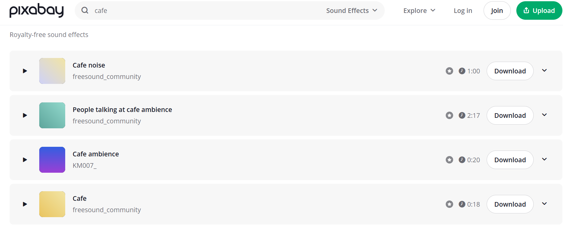
Chosen Sound:

After looking through the Website, I was able to whittle the sound that i had favourited down to this audio. The thing that I looked about this audio was that it was the perfect amount of discussion It had the preferred amount of voices that were at the right noise level, which was quite hard to find because I was looking for a very specific style of sound which emulated a murmur but one where you could still pick up individual voices. Another thing that I liked was that at the start of the sound, you can hear a clinking sound which almost sounds like a spoon tapping in the edge of a cup. However, I liked this because it could potentially emulate the sound of object/s being moved around which represents the dynamic nature that I am looking for in the composition of this sound. The final thing which was good is that this was one of the longest audios that I could find meaning that I could give Rory lots of room to play and adapt when creating the visual.
In relation to development, I think that when it comes time to actually execute this experiment, I actually want to try and release as much of these expectations as much as possible. I think I want to do this because I don't was to unconsciously effect the outcome as I want it to be as organic as possible. I want the main focus to be on the people and their objects and acquiring anything that represents that is a great success.
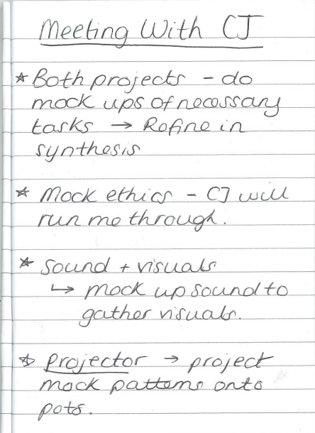
Collaboration Development: Meeting with Rory Villars
For this collaboration, I chose to collaborate with an associate from Future Media Production which is a Man Met University course based in the school of digital arts (SODA). I met Rory through a few mutual friends in the university and I knew that he specialised in audio visual design so as soon as I had this idea I though of him straight away as he would be perfect for this collaboration. I don't know Rory that well so hopefully, throughout this collaboration, we will be able to get closer so that we can create a mutual resolution that we are both proud of. The course itself is primarily centred around audio visual design spanning into set design which is why I thought it would be ideal for what I am trying to achieve as I am aiming to create a visual that is responsive to personally sourced audio. Although I said that this term, I wouldn't be able to execute the full conceptual idea that I had in mind, In this meeting I wanted to make sure that I described my plans for where this project would be going.
Including things like why I like looking into this area, what the full picture of what the experiment is, research and development I have completed throughout this project and just my personal craft overall, like what the key things are that influence my making. I thought that this was extremely important because it has allowed Rory to gain a bigger picture of the whole project itself and get a better understanding that he could potentially then transfer into the visual; giving him the bigger picture so that he is able to create a visual that represents what I am trying to show a a designer. See below for the audio I showed:

Mind-map I made summarising my craft and my motivations within this project that I wanted to reference throughout the semester.
Information gathered from meeting:
Sam Meech Projection (Captured via Video)
Aesthetics and Movement:
In the meeting we obviously started off by discussing what the project is about but the next thing that we touched on is the projection itself. I showed him the inspiration images that I had collated and just highlighted the elements that I liked about them and why; for example, circular patterns, colour schemes, line formation etc. I also described what sort of movement I wanted to see within the projection because it was something that I knew I needed to communicate as it is key to how the project will be executed. I discussed how I wanted the visual to be slow and morphic giving it the ability to create a relaxing ambient space. In terms of looks, I want it to look rather organic, especially when it comes to the style of movement, linking in the work of Sam Meech as I also showed this to Rory as a reference because the work that I mentioned earlier in my research touches on the movement of micro-organisms. In relation to the physical design, I really wanted to take a step back almost as I only showed Rory things like inspiration photos and keywords because I really want this to be representative of both of our creativity. Meaning that I really want to see what he creates in response to my ideas, really embracing the opportunity that I have to see how someone else's brain works.
Process and Understanding:
From this discussion, me and Rory were able to get on level ground when discussing how we both work. The way that Rory would like to do it is that he will create around 3 different visuals that have different qualities like speed of movement and composition and we could both then have another to tweak and whittle down the choice of design. This was perfect for me because I can liken this process to sketching different ideas and seeing which one works which is a process that I actually put into practice when dealing with things like commissions. This will also allow for me to tweak the projection so that I can achieve the best and most representative outcome. However, due to the time constraints this term, all I need is a rough projection that represents vision and workflow because the execution of the workflow is something that I want to get concrete for this term. Getting a clear base now is the priority because I will continue to develop on this idea for the following semester so there will be definite room for refinement after this unit.
Final images I chose to send Rory for inspiration:


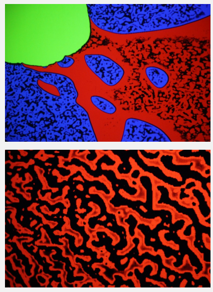
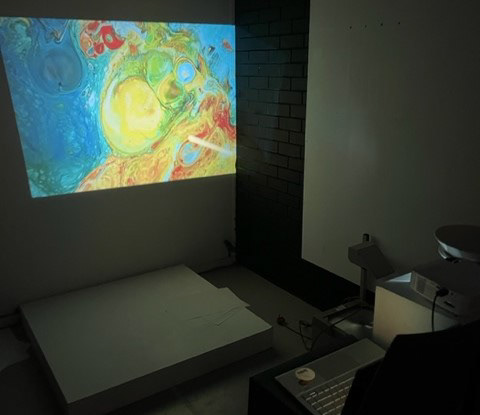
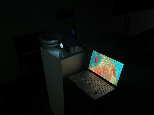
Testing Development:
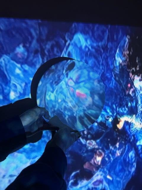
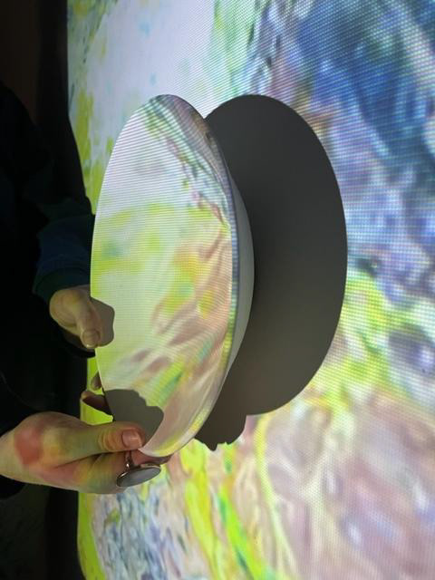
Above are the sample videos that I have chosen to use for the testing of the projection. I chose these because they are representative of the key elements in my personal projection. These visuals are abstract in form with bold colour and morphic, organic movement. These videos will mainly act as a interim projection for the time being whilst I await on the drafts from my associate from Future Media Production. Whilst I await on the intended samples to come out of the kiln, I decided to try and source a projector and luckily, my course mate Lils had one that she could bring in for me. I wanted to do a quick test on a piece that I had already made just to see what it would look like. This was done under a table so it isn't the most refined test but I just wanted to get a bit of a physical visualisation of what the overall idea could look like.
See below for initial test:
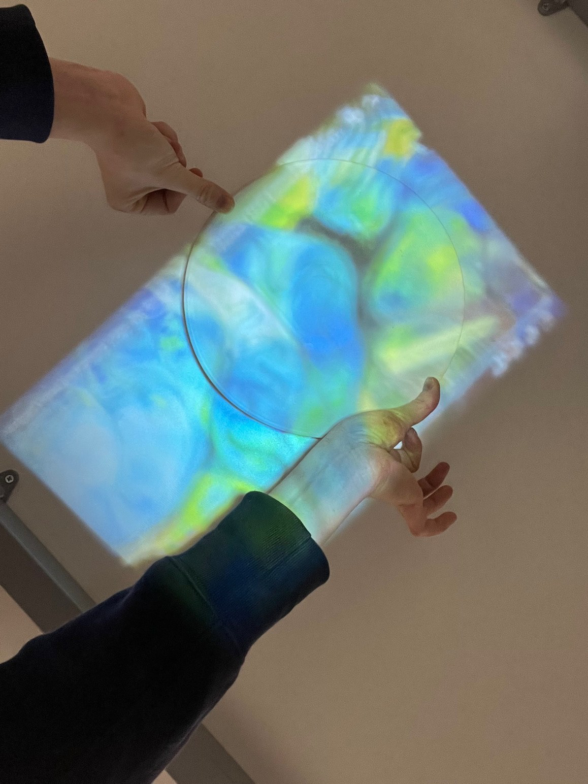
Overall, this was a good choice I feel because in the moment, it honestly filled me with lots of excitement! I had a genuine feeling of happiness when I did this test because it actually made something that has purely part of my own theory based ideation into something tangible. That feeling of excitement solely came from something coming from my brain and then being translated on to a material/ object, and MY object! I loved everything about it, the colour, its abstract nature; when looking at it, I instantly looked at it as it if was capturing a moment, a moment that encompassed wholly within this simple circle. This testing was a good way to open the door into the new stage of testing and will definitely be developed in the next few days so that it can effectively inform my future practice. However, this test was quite blurry because the projector was too close to the underside of the table so hopefully, in future tests it will be a lot more defined.
Further Testing Development:
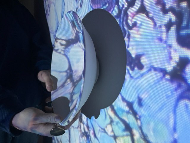
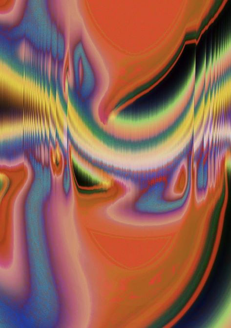
For this testing, I wanted to try my best to create a set up that would be similar to the one I would be using for my final resolution. This was a relatively easy set up as I was able to use the box as a base for it which meant that I could control aspects like light and placement well as there was no one in there. To complete this, I used the same video that I used in the previous testing as I think that it best represents the key elements of what I want my projection to have, for example, abstract movement, bold and intertwining colours.
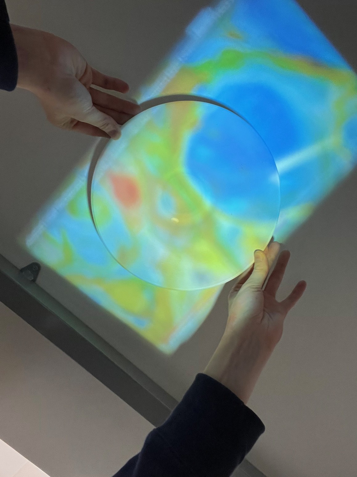
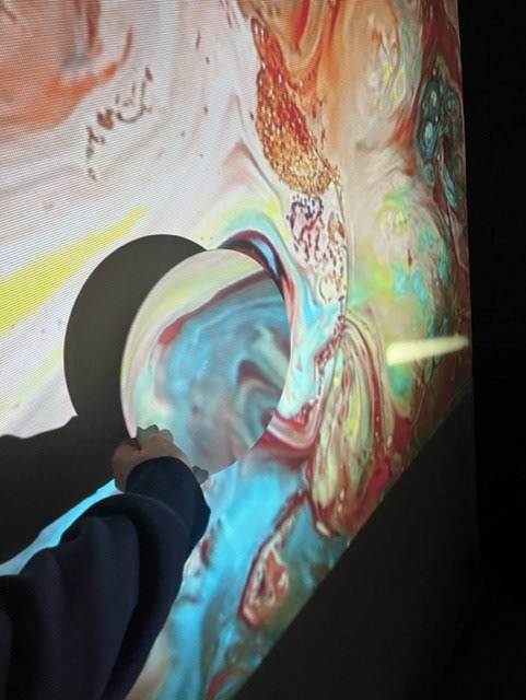
Surface Finishes for testing samples:
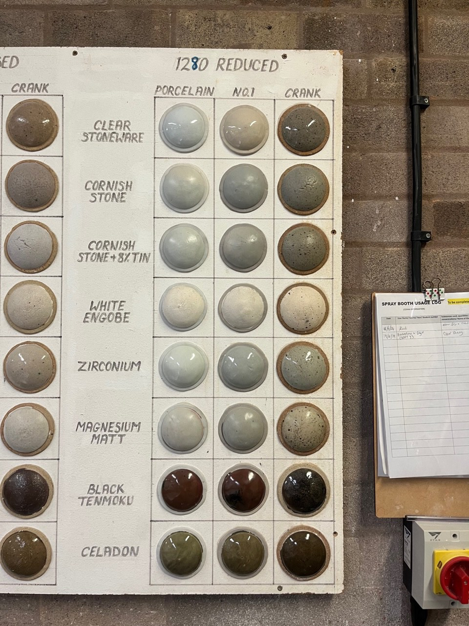
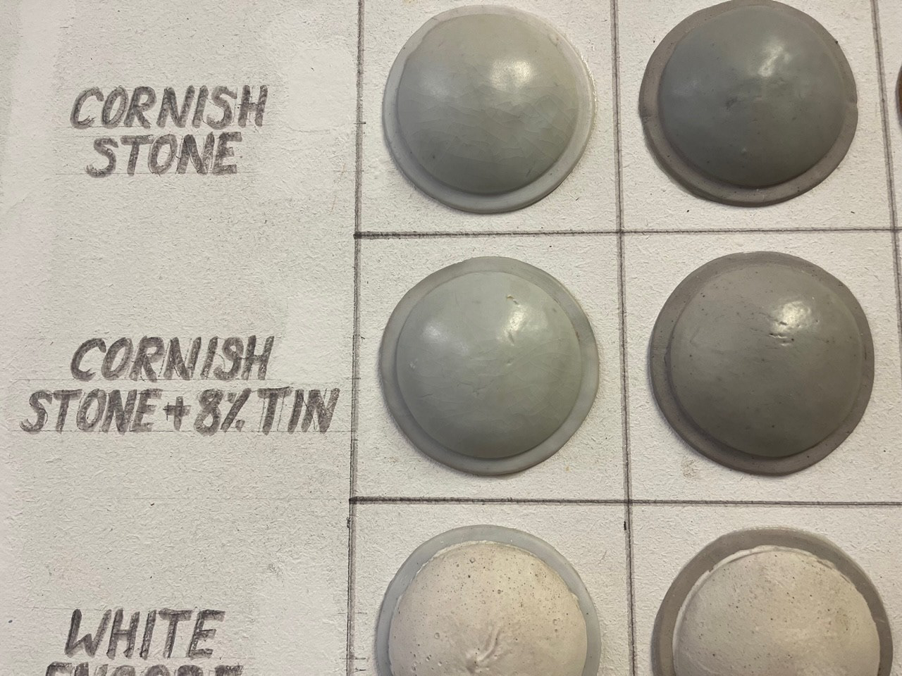
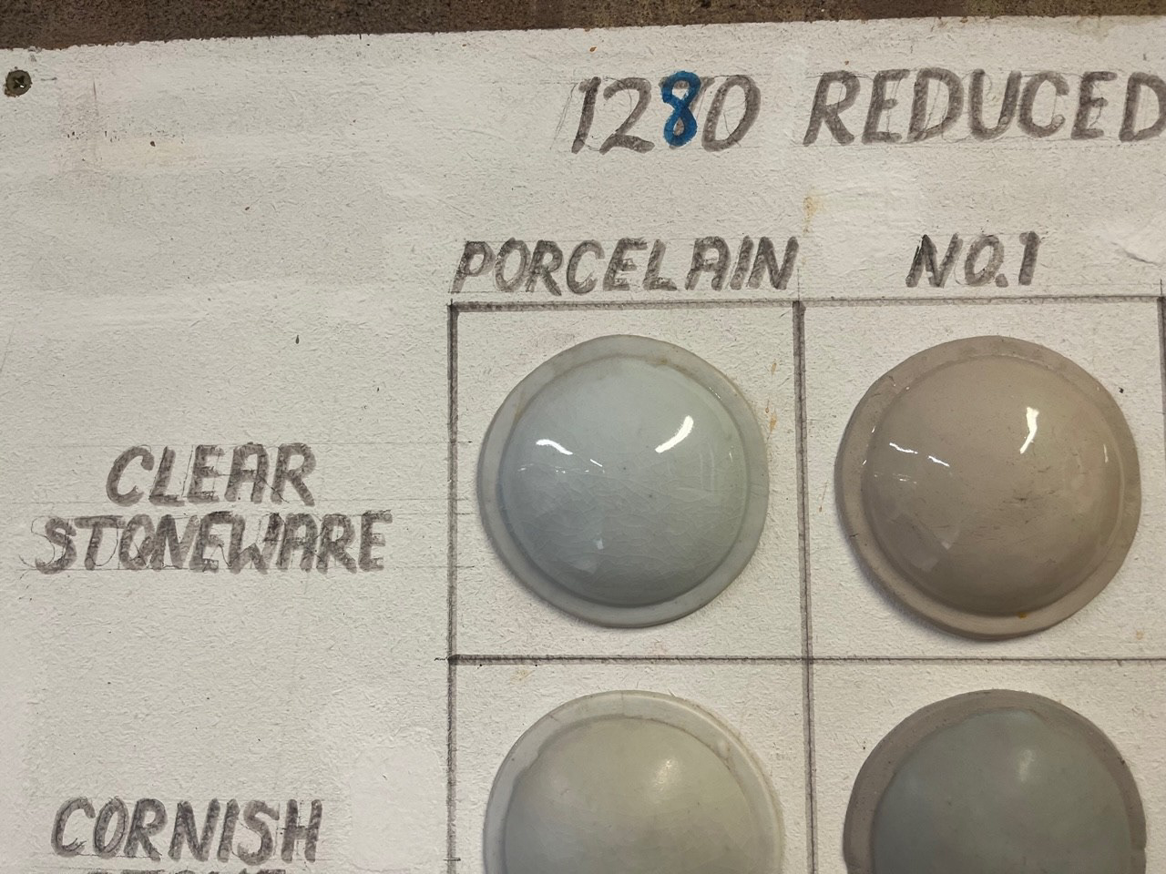
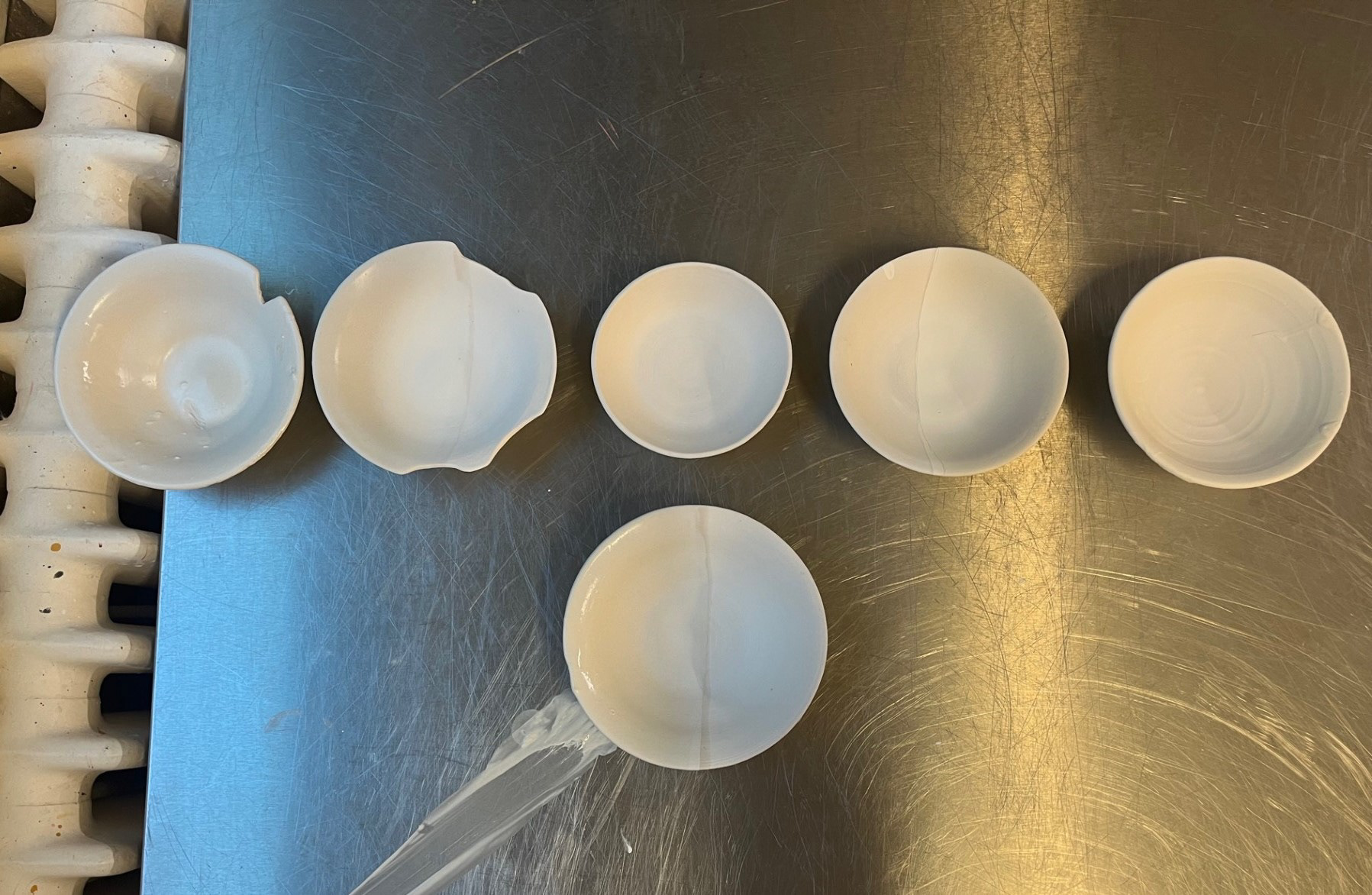
In the middle is a no glaze finish, the three around it are the 50/50 splits combining different finishes and the two on the outside are purely one of each glaze, clear shiny and Cornish stoneware.
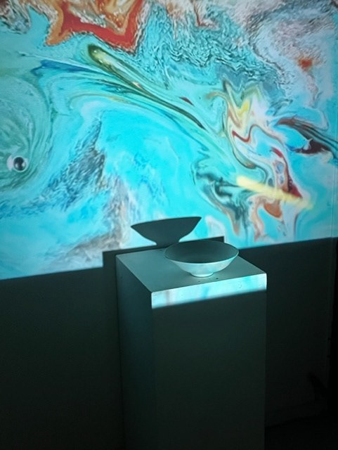
See below for testing:
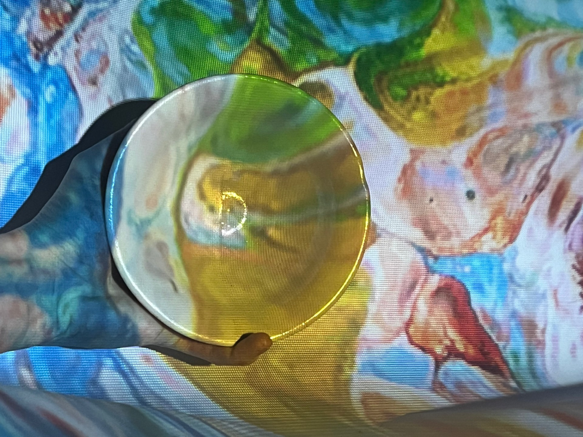
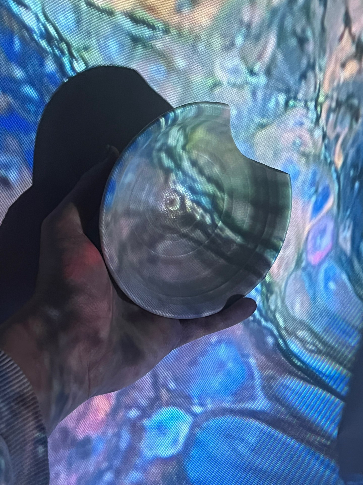
On camera you cant tell very well but in person I was able to see a real difference between the 3 types of surface ranging from brightness, definition light reflection etc. For example The matte and no glaze finish both allowed for a bit more definition (as it is like a page) however it made the projection significantly duller than with the shiny finish. Personally, I think I much prefer the shint finish to the others as it adds that element of wow to the pieces. I loved how the light from the projector would bounce around the piece making little highlights throughout. I also feel like I resonated with the symbolism of the shiny surface as it can relate to the reflection of myself that I am showing through these vessels within the creation process.
Initial Projection:
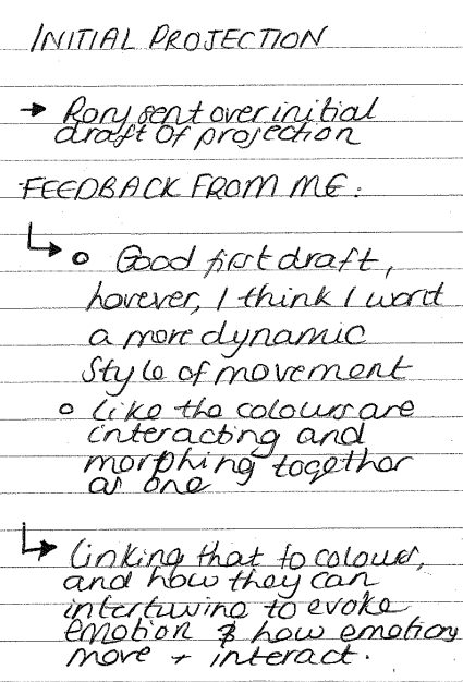
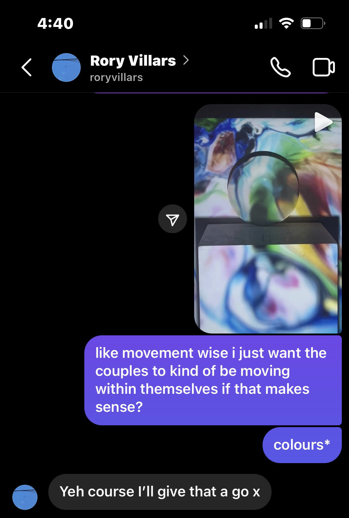
After seeing Rory's initial design I was amazed at how well he was able to capture my vision. Although i was happy there were still a few tweaks that needed to be made. The first tweak that i had was that I wanted the movement of the visual to be much more organic almost lime they are folding in on themselves. Ideally I wanted the colours to blur as well however there were some limitations to Rory's abilities as well as the software he was using. Another thing that I asked was if it was possible to add more colours into the mix. The main reason that I want this is because i wanted there to be a bold and varied colour selection so that my outcome can really reflect my research into colour psychology and theory. Next term, I think that I will hone in on specific colours and why I'm choosing them as I will have the time to complete further research and testing on the matter. So far, my main rationale for the colour choice is that I wanted to feature basic primary colours: red, yellow and blue, and then I personally wanted to add green as its a colour that I have my own personal associations with that bring me happiness and contentment (as well as blue - come as a pair).
See below for revised visual:
after hearing the feedback Rory made a couple of tweaks to the visual. The main thing in this one was the movement. He sent me the two so that I could see which speed of movement I liked the best. The image on the right is a lot more reactive to the actual sound hence why it has a more jagged movement. Rory informed me that, because the sound is compiled of lots of different voices, it would be hard to make it look any less jagged if I he were to increase the sound reactiveness. I decided to go for the slower movement because it looked much more harmonious and fluid which are features that I am looking for within this projection.
Overall, I am very happy with this design. The colours are much more representative of what I wanted to put across with my final resolution, meaning it features primary and tertiary colours. I also really like the revised movement style of this visual as I feel like it is a lot more relaxed and organic. When watching it, it really makes me feel calm as it continuous flowing movement is at a perfect pace. Seeing this developed version of the visual really made me see how beautiful movement can be. The visual makes the colours come to life. as they move across the screen, it is like they are on their own journey, discovering where they can move and how they can get there. For me, I think that this continual movement resonates with me so much as I feel like it represents my own journey and the fun and continual growth that I have been experiencing throughout this project. One thing that I would tweak about this visual however is that I would like for it to be slightly brighter as I feel like it wouldn't show up very well on the projection.
Rationale behind my choice in projection style:
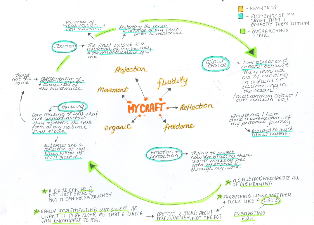
I wanted to do this in the lead up to receiving the final resolution so that it could act as a small collation of my thoughts, realisations and associations throughout this project. I have realised so much about this project as I have really pushed and encouraged personal reflection so that I can dig deeper to find out my true motivations behind my craft. At this point in the project, i have realised that everything is a reflection of my personal journey and and how I can fuse it with the idea of influencing peoples perceptions. In this mind map, there are a few key words in the center that i have used throughout this project to describe my craft. Now, with a new and expanded view, I can see that all of the things that I naturally carry out through making processes and ideation can all be deeply linked to these few words.
The projection element really resonates with me because of the constant stive that I have had to project my mind onto my material. This urge that I have had to be enthralled in flow is a true embodiment of what it means to put my all into my work. Unravelling my mind through making is my way of letting myself reach my full creative potential and using projection as an element can be symbolic of that. Further symbolism in this idea comes through the actual pots themselves. For me, the circular pots represent the true encompassment of my journey, linking to the symbolism of a circle, and showing how this process has been full circle as I have gotten so much out of it in my own personal way.
Final Presentation: Planning
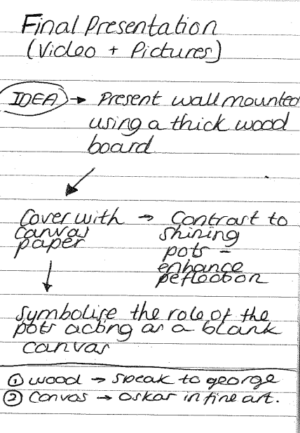
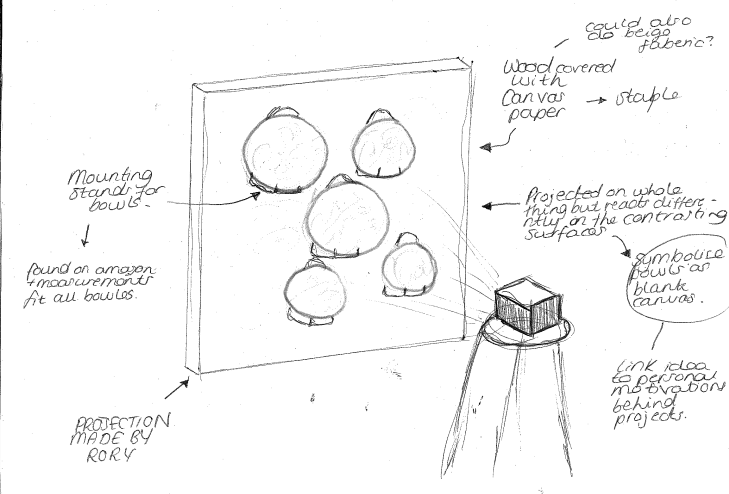
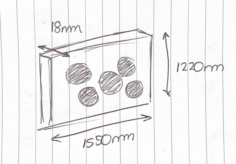
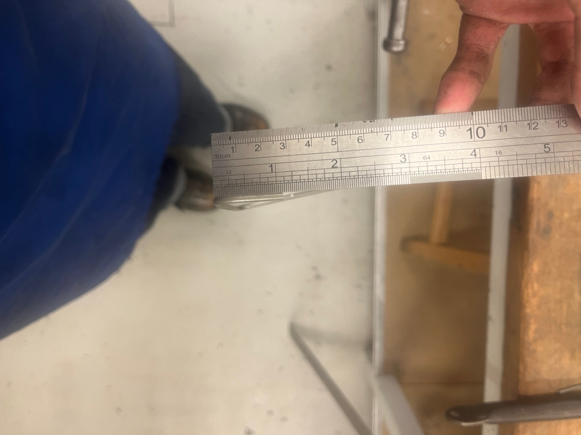
For my final presentation, I have chosen to use a backboard because it will allow me to manipulate the backdrop to my pieces a lot easier as I will be able to implement slight colour or texture if I desire. Another reason I did this was because I thought it would be easier to fill in the holes in the actual wall if there were only a few; compared to the 20 or so that it would've been if I decided to screw straight into the wall. Before going into wood, I knew that I would need to go to them with a measurement so I made up a rough ball park figure from thinking bout the 5 bowls that I would be putting on the board. I chose these measurements because they would allow for a bit of extra space if I wanted to make them more spaced apart. I just thought it was good to go bigger in this case because having too little board could result in the final resolution looking unrefined.
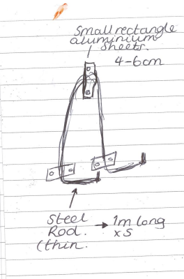
At first, I was going to just order some bowl hooks off amazon however upon researching, I realised that none of them were going to be big enough. The majority of mounts that I could find were plate mounts so the depth wouldn't have been big enough to fit my bowls onto. Another issue with ordering them was that the price of them was quite expensive and since I needed 5, I would've been a massive expense. Upon thinking, I realised that i could give it a go making them myself! I decided to go speak to Paul in the metal workshop to see what he thought. He said that I would need to do a brief online induction first but it would be easy for him to show me how to do it. The plan that we both settled on was using the smallest gage steel rod to create the frame and then cut small aluminium pieces to hold up and support the weight of the bowls. When I came to Paul with the idea he seemed quite positive so I'm exited to give this a go.
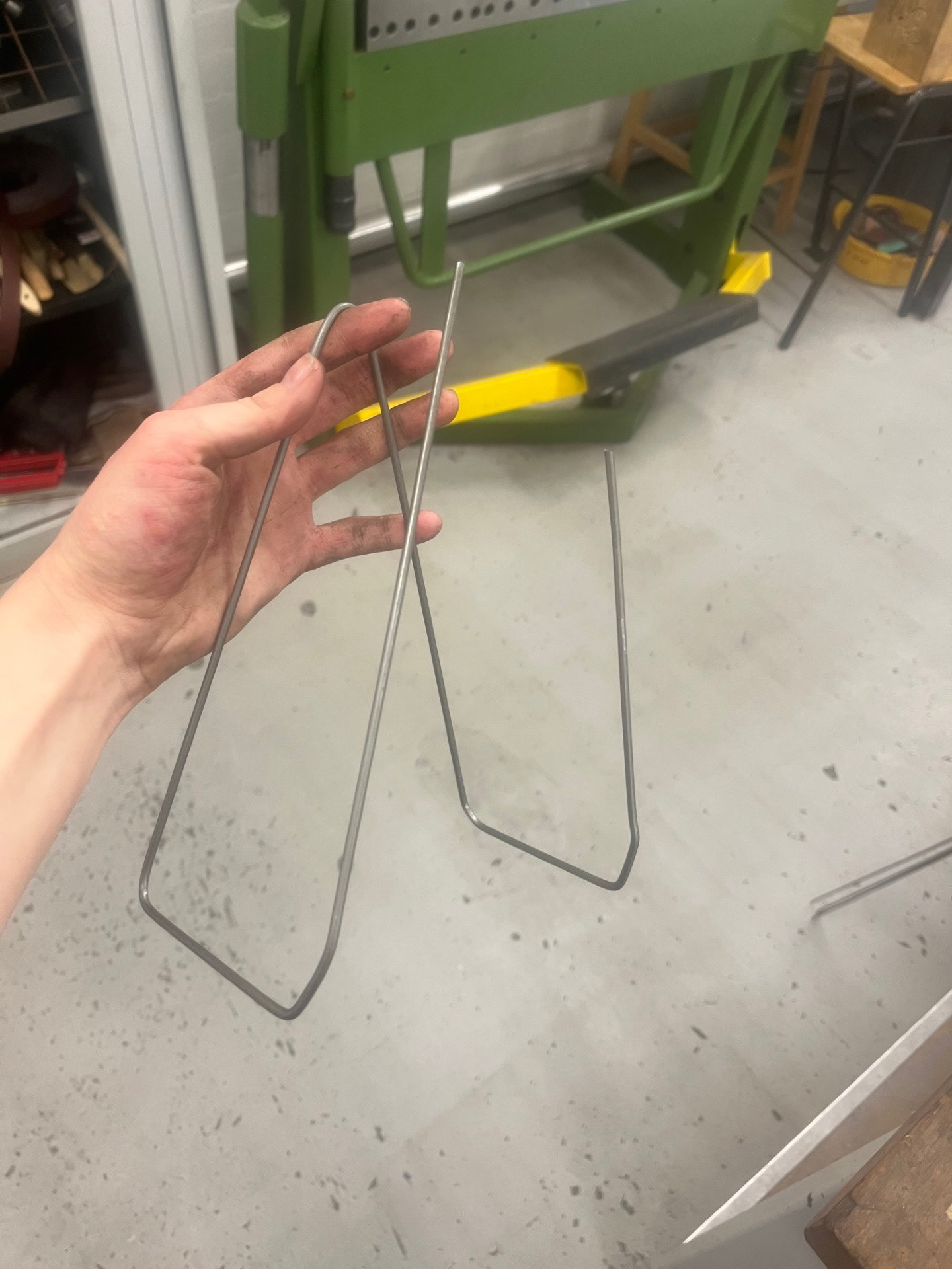
Making the stands:
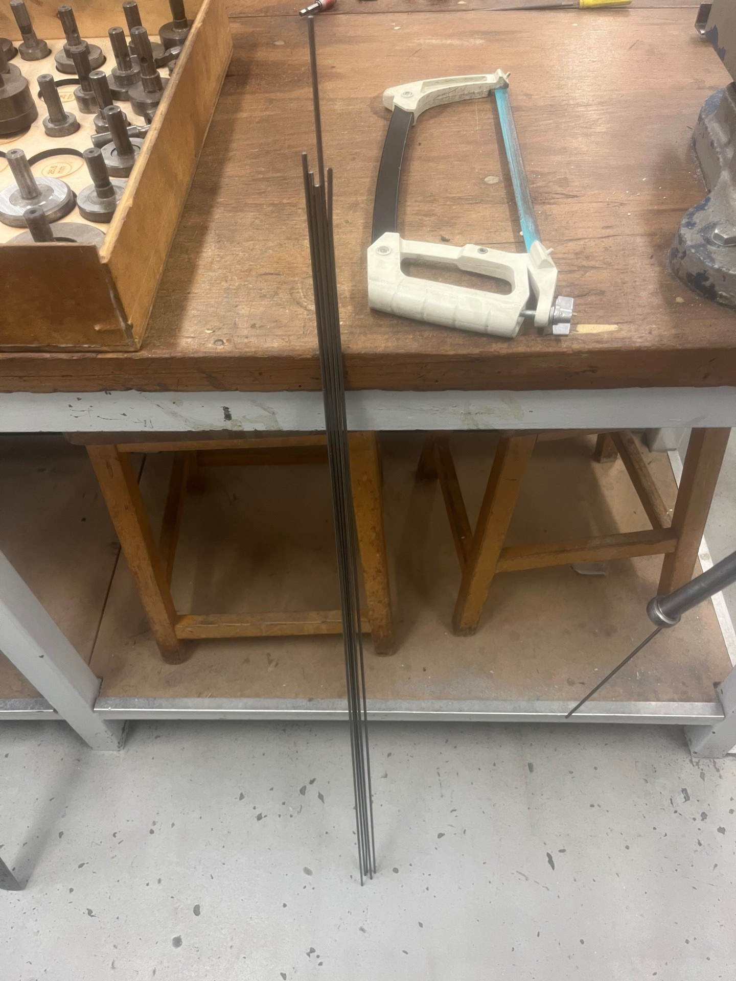
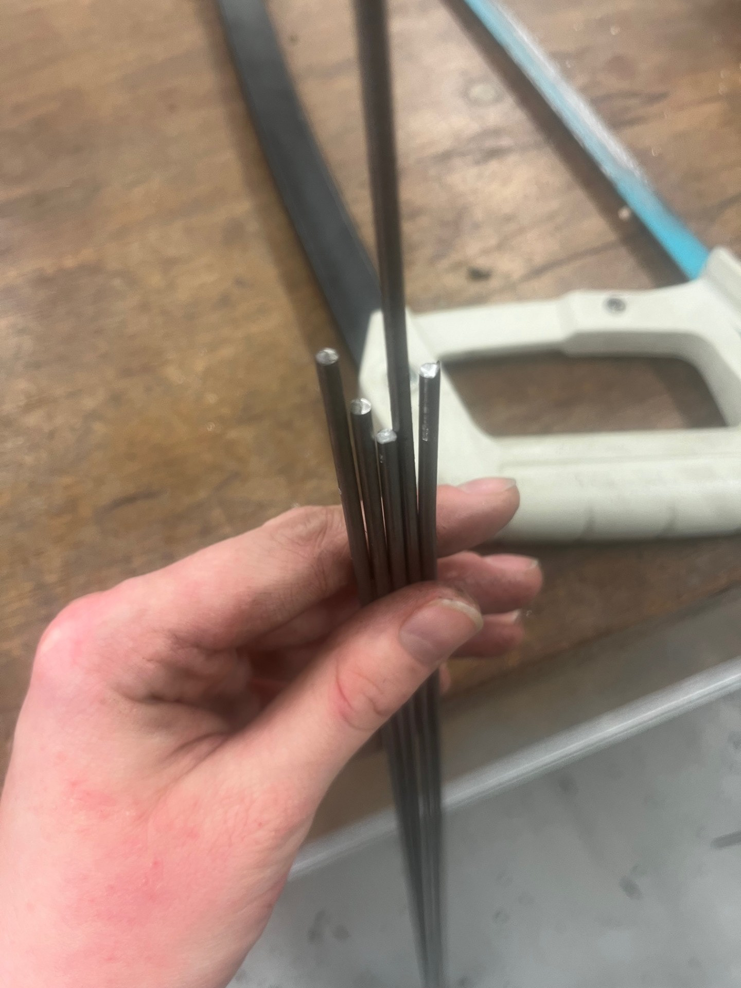
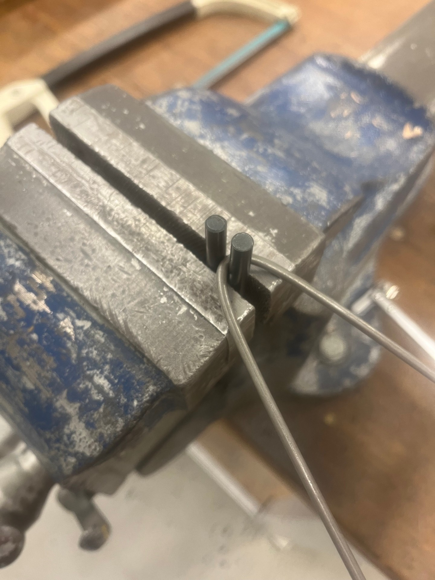
i started off by cutting the 5mm wire into rough metre long sections. I cut myself 6 so that I would have 5 for the bowls and then one spare in case one went wrong. the next thing that I did was put two drill bits into the vice so that I could use them to bend the wire at the middle of the rod.
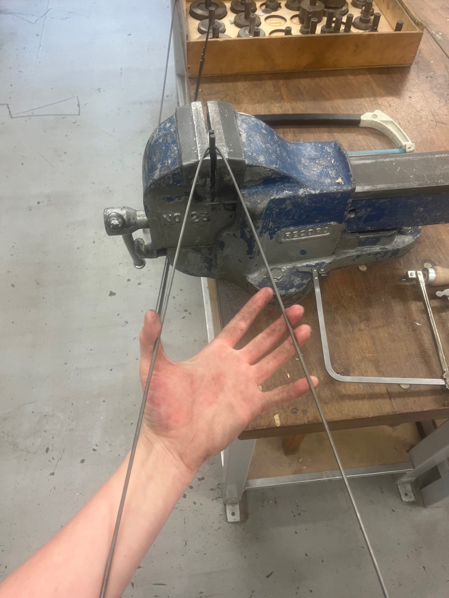
the next thing I did was bend the legs all at 8cm and I brought in a bowl so that I could make sure that it fitted right.
Overall I am really happy with the outcome of these stands considering its my first time in big metal. I think that next time I would like to take my time a bit more because i felt like I rushed myself a bit, for example, I want to get concise and backed up measurements because throughout this process I messed up a couple of times because I rushed the process. Going forward, i think that I definitely want to incorporate metal into my future projects because i had a lot of fun. Due to the fact that I don't have much time left in uni, I think that this will purely be on a curation basis, e.g. stands, supports, plinths etc.
Making the Supports:
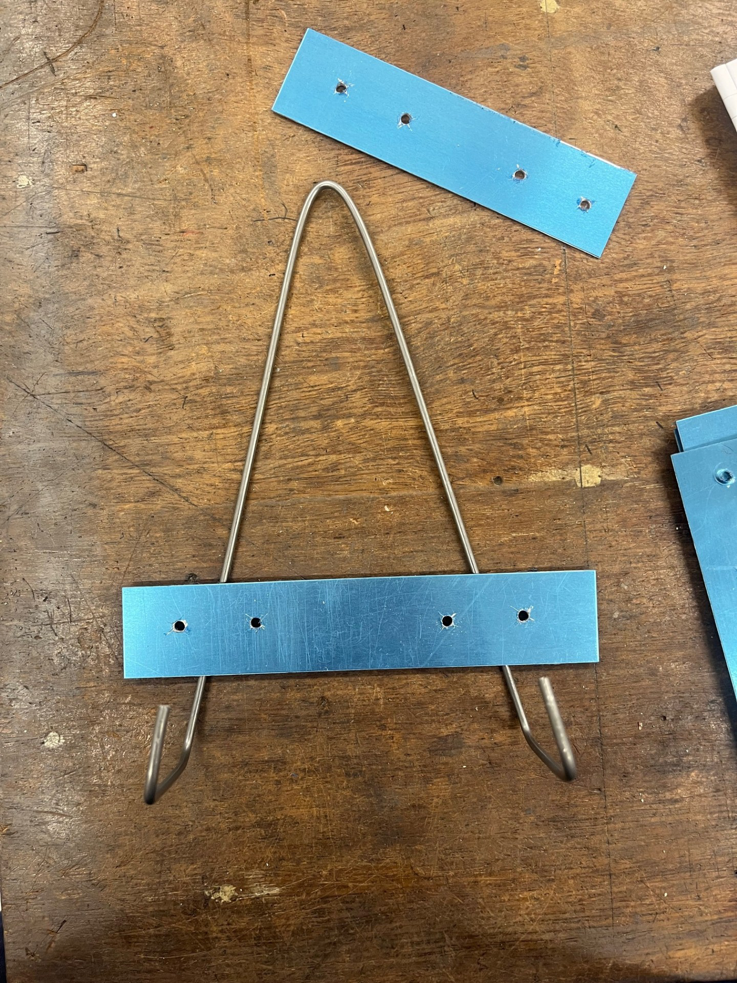
Using the guillotine, I cut some pieces of scrap aluminium into strips and then marked out where I wanted to drill. I then used a hammer to make indents ready to drill.
Test Projections:
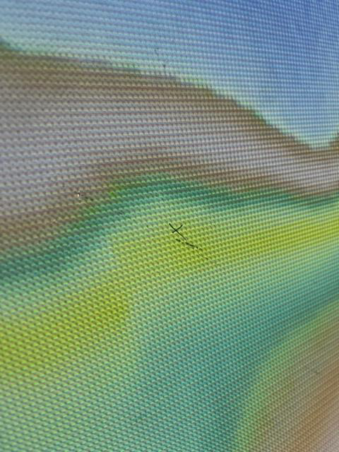
When fixing the stands to the wall, I realised that I might not need the additional aluminium strips as the pieces are being held up well by just the stands and one screws. This is good because it will allow me to avoid putting too many holes in the wall. Using a singular screw to hold up the stand was well enough supports combined with the fact that they are made of steel wire. To sort out placement, I ran the projection through and noted areas that had a lot of activity and made small marks of where the pots could go. I used this method to sort out a rough scattered arrangement.
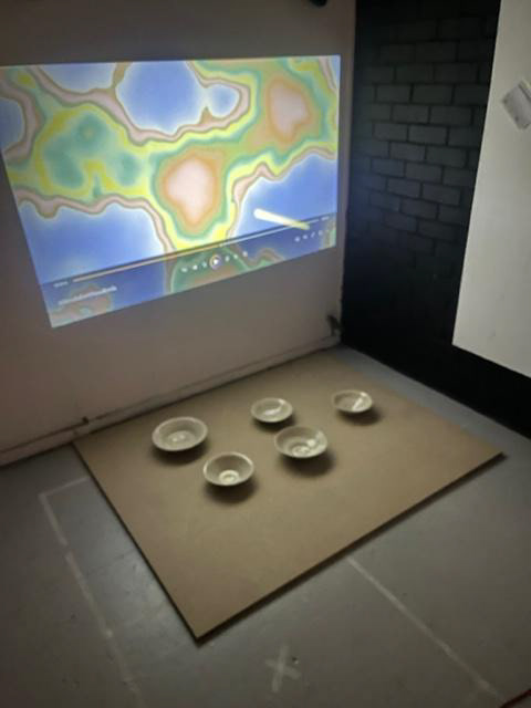
Using the sample video (most recent rendition) created by Rory I have done some test videos. For these tests have implemented both white and black backgrounds so I can see the contrast. For the black background I went to the make more store and bought some jet black fabric. this was recommended to me in a meeting with Geoff as he said the contrast would be better if I did the white bowls on the black background.
For this testing, I am really happy with the outcome and it filled me with a lot of joy seeing this all come together. for this I tried 2 different compositions of the projection. the initial one was quite spread out and my rationale behind it was that you would be able to see the effect of the whole projection on the pots and not just one isolated area. Although this rationale made more sense to me, I just really didn't like the look of it because I felt it made it look unrefined. I decided to create a new assortment that was more clustered and I really liked it. On the right is the initial assortment with the white background and on the left is the revised assortment with the black background.
Testing the difference between the two backgrounds was very valuable because I thought that I was going to prefer the white because it allows you to see the whole projection for what it is. however I actually much preferred the black because it made the bowls pop so much more and overall made it look so much more refined. Plus the wall was pretty ugly as well I wont lie. This was very helpful line of inquiry because it enabled me to figure out a more refined form of presentation. Going froward I am going to be using the assortment and background from the sample video on the left for my final resolution.
Final Video:
For the final resolution, the only change that has been made was that it is a bit brighter then the previous visual. The previous visual for me was slightly too pale and when projecting it became even paler. Brightness was key for me because I wanted the final visual to be representative of the colour wheel and colour theory research that I completed and this one id definitely representative of that!
Final Resolution:


Final Reflection
Overall, I am really happy with the outcome of this project. The resolution feels refined and represents the type of spectacle I aimed to create when I first conceived this idea. While the projection itself could have been more sound-reactive, I introduced that element quite late in the term, so it’s understandable that there wasn’t much time for precise refinement. I recognize that there are a few gaps in terms of reasoning and evidence to support why I made certain choices, but I intend to investigate these further during synthesis and resolution. Personally, I am very proud of how far I have come in both a practical and personal sense. my practical work has come on leaps and bounds since we started this year and I'm exited to put the effort into developing it further in the new year. this project has also facilitated much growth in my personal determination and general standing within the crafting world and I look forwards to discovering more about myself in synthesis and resolution.
One aspect however that I think that I could have improved on is the depth and quality of my making and documentation of making. Most of the time I find it hard to see a clear direction for myself because I have a lot of ideas that flood my brain all at once. This results in me just making and not really having much direction but also results in me getting caught up in the moment and not documenting any of it. Next term I think that I really want to improve on this by trying my best to have a clear direction to make it easier for myself to achieve my goals. I also think that I would've liked to push myself further in terms of scale because I really want to achieve my goal of continually increasing my scale. As a whole, this line of inquiry has been both fun and insightful. However, next term, I envision focusing on something that feels more representative of me as a maker and making that the central focus of my work. I want to ensure my making is the focal point, and over Christmas, I plan to reflect on how I can integrate the elements I consider essential to my craft into something that truly embodies who I am.
Personal Future Development:
With regards to future, I am not one that likes to plan too far ahead because I much prefer to stay in the moment. However, thinking about it now within a craft context, it actually makes me exited. I want to plan my future because I can see myself actually putting the effort in to something that is worthwhile. As designer, I understand that I should set my sights high so that I can achieve my fullest potential, but honestly, that is not for me. I think that I have known from the get go that I don't want to be the next big name in the crafting world. Hence why I like to mainly focus on refinement when it comes to my practical work; I just want to make me a better version of myself as a maker. As I said above, when thinking about my life after university, the thing that I am definitely more driven to events wise is makers markets. I like my things going to people so that they can use and appreciate them in their own ways, not so they can go to the highest bidder and be looked at through a glass case. I want people to touch, feel and experience my work in a personal way! Going into this research, there are a couple of different avenues that I could possibly explore as I have given them thought a few times before. See below for research:
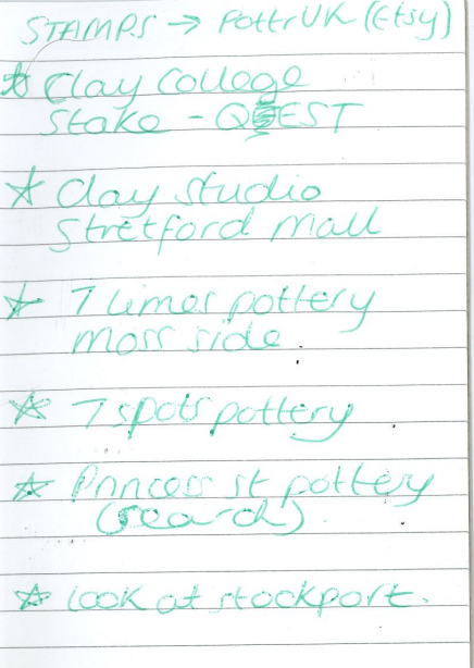
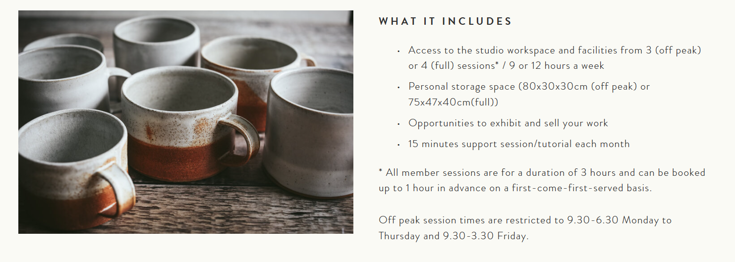
Clay Studio is based in Stretford Mall and is a pottery studio that I had initially researched in the previous years project understanding context. I wanted to look at this because it would cover all situation bases, for example, if I wanted to work a normal full time job but didn't want to give up my practice. I think that accounting for all of these possibilities is good because it will get me ready for whatever comes my way when leaving university; covering all my bases.
Employment:
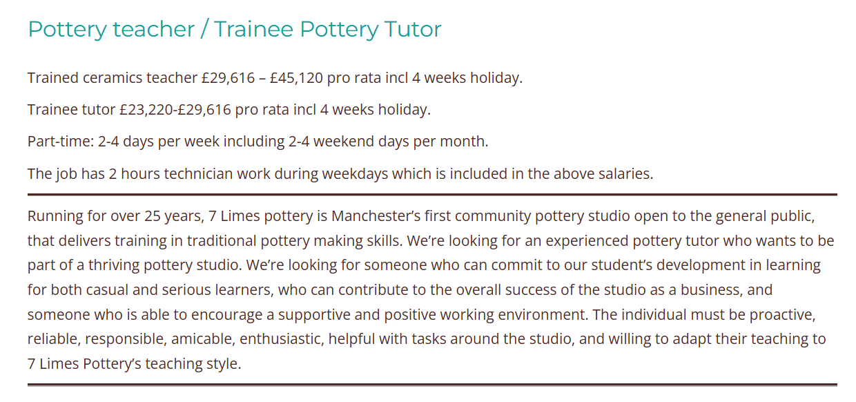
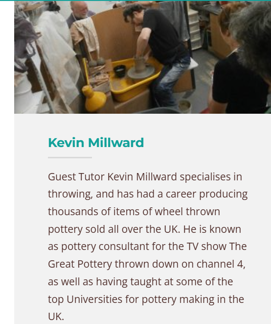
I think that having a full time job after university is something that I had already prepared myself for; however, upon researching I never actually thought I could do do it in ceramics. For me, I think that this would be ideal because I love ceramics and any way that I can keep in physical contact with clay on a regular basis would genuinely be so important to me. 7 Limes Pottery also offers a trainee tutor program which will be a very good opportunity as I wouldn't have had any training prior to this point. it will also be good because, yes I do think I have learned a a lot of things since being at university, but I might need a refresh on not just things that they specifically teach but also how they do it. This establishment also has a resident potter named Kevin Milward. He is a very experienced potter who is very well know in his field and has been a pottery consultant on the great pottery showdown. I think that having the opportunity to be in the same environment as someone like this would be amazing as it would allow me to take my pottery to the next level and refine my practice further than I could ever imagine.
Another thing that I realised through looking at the pictures, which in my eyes is a small bonus, is the wheel in the image on the right as it is one of the ones that we have in uni. this is good for me because at this current point in time, I have struggled to get to get to grips with the newer wheels so I think this could potentially be a good way to ease me in to the new environment :)
This location is also ideal because I know the area rather well since the location is not far from where my accommodation was in first year of university. This Location is also kind of perfect because the main areas that I will probably be based are between town and somewhere like Didsbury or Chorlton and this is pretty much in between the two! Being close to town is also always good as it usually means that I'm closer to a few more opportunities (e.g. markets).
Clay College, Stoke
Guldagergaard, Denmark
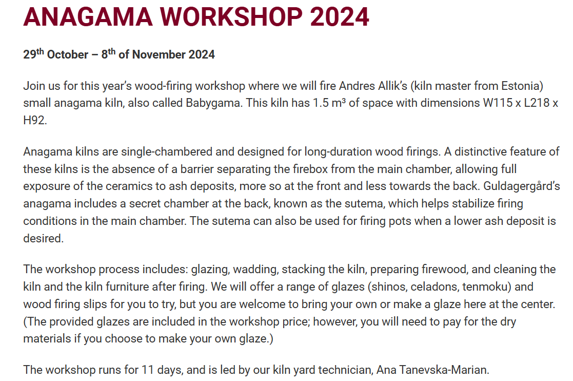
Process Another thing that Guldagergaard offers is workshops. These workshops span over a week to two weeks and they offer an introduction to new and fun methods of creating and finishing ceramics. This example of one that I found is an Anagama kiln workshop that offers all processes such as, glazing, wadding, stacking the kiln, preparing the wood and cleaning the kiln. Things like this would be ideal because this would give me the opportunity to visit the facility and test out everything to see if I lie it or not. Also, if I am going to be living in Manchester after university, I might only be able to go in small bursts because I need to be able to maintain a stable income. This would also contribute to me completing further skill development and learning relating to my practice after university.
Application Process:
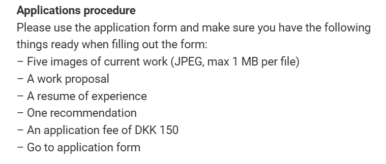
In terms of the application, There are 2 main things that I would really need to consider if thinking of applying for Guldagergaard. The first one would be images of work. I think that that's important/relevant for my current project because I need to get used to taking professional pictures of my work so that they can be seen in their best light. Now, as I haven't yet applied for any serious 'real life' things yet I haven't really seen much need to take good pictures but now that I am actually considering entering the ceramics world after university, I have an inner drive to push myself to shed the perfect light on my work. Another thing that this needed was a professional CV. A ceramic/ Practice CV is something that I have heard of, definitely more in the last few weeks when we have had guest talks from people in the industry, like Lillie Tew and Joanna Hejmej. Both of them said that having a professional CV is important for moving into the ceramics industry, even if its not very full at the start.